Project Touchdown
Bengaluru
Residential
Travellers love to seek out treasures of their travels and bring back beautiful memories. The house in particular was designed around the client’s love for travelling, showcasing his journey from around the world. The home was curated and designed around existing artwork, with the purpose of reusing and repurposing furniture with an established backstory behind them. The designs were mostly sketched out, hand drawn and visualized rather designing using 3D software.
The entire boutique apartment had 6 flats, the client’s being the penthouse on the third floor.
Living Room
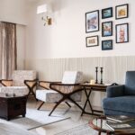
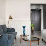
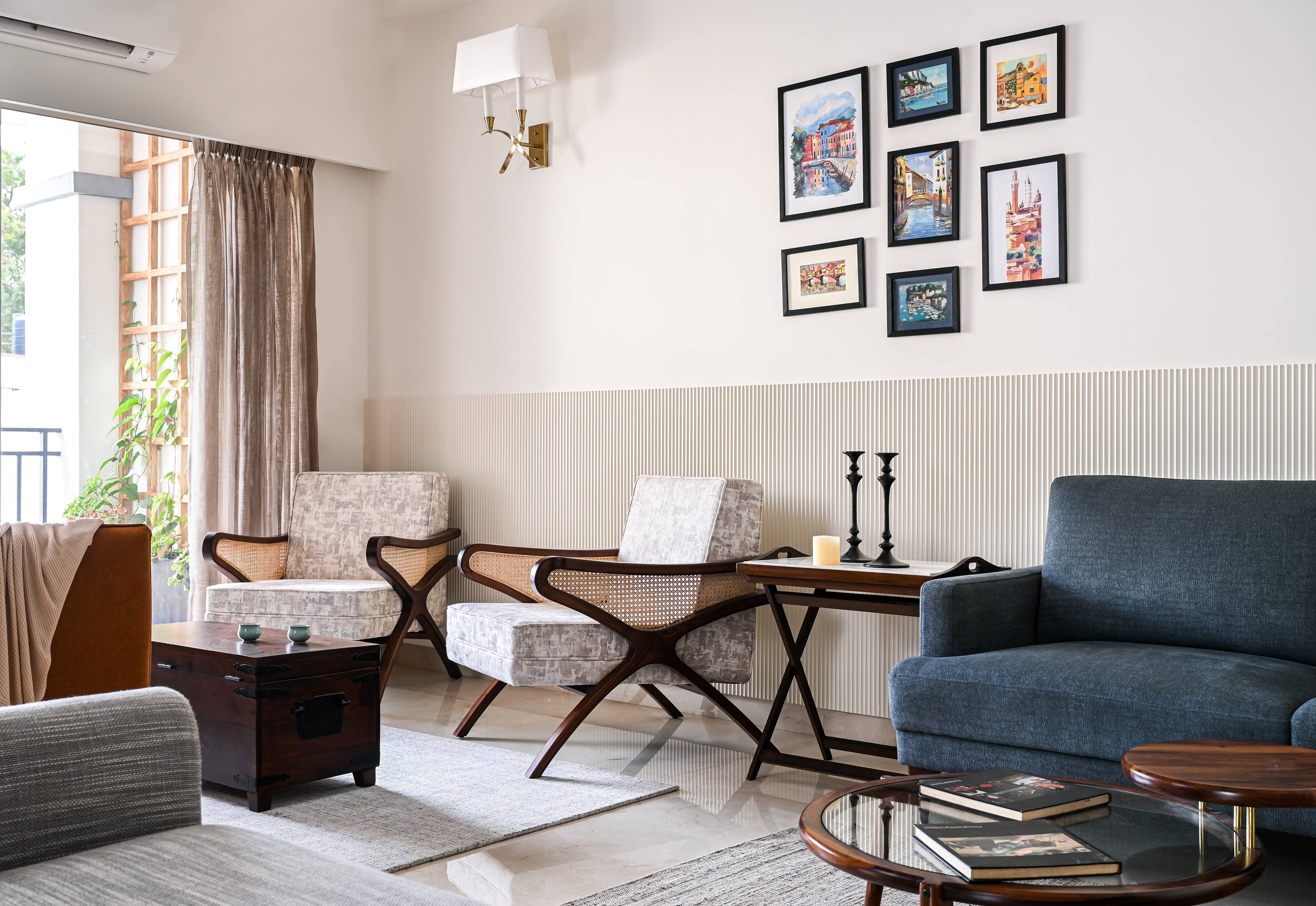
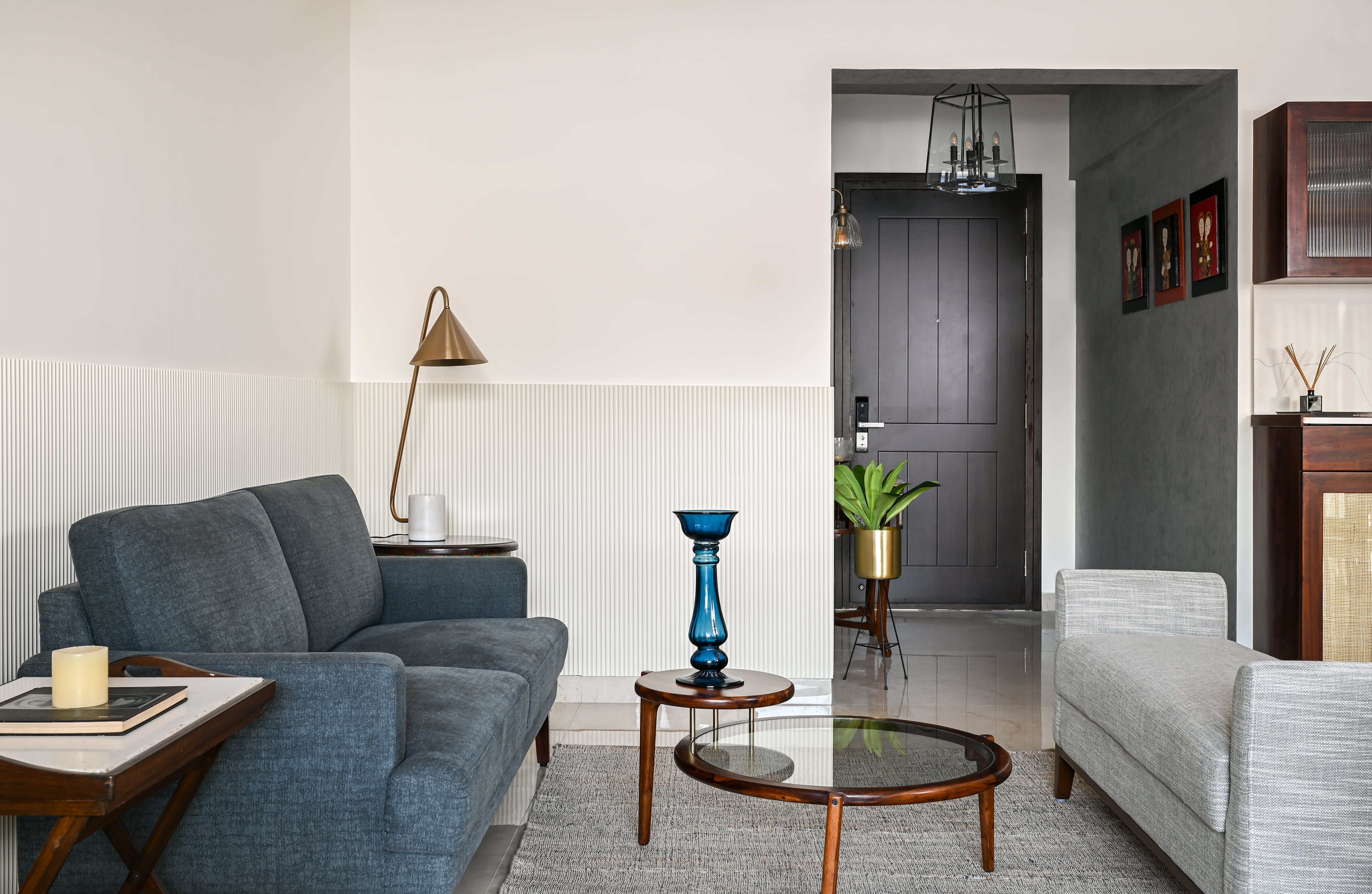
A defining ribbed, grooved panel ran behind the sofas and wrapped around the L-shaped wall. The whole ground floor served as a formal hosting space. The living room looked out into a small balcony with an eye-catching trellis. Blue, rust and neutral textures were used to add a striking contrast. The client’s artwork illustrations from Italy added serenity into the room.
Lighting played an important role as no false ceilings were involved. Décor lights were used to give the space an old-world charm. An important aspect was merging the old and the new décor.
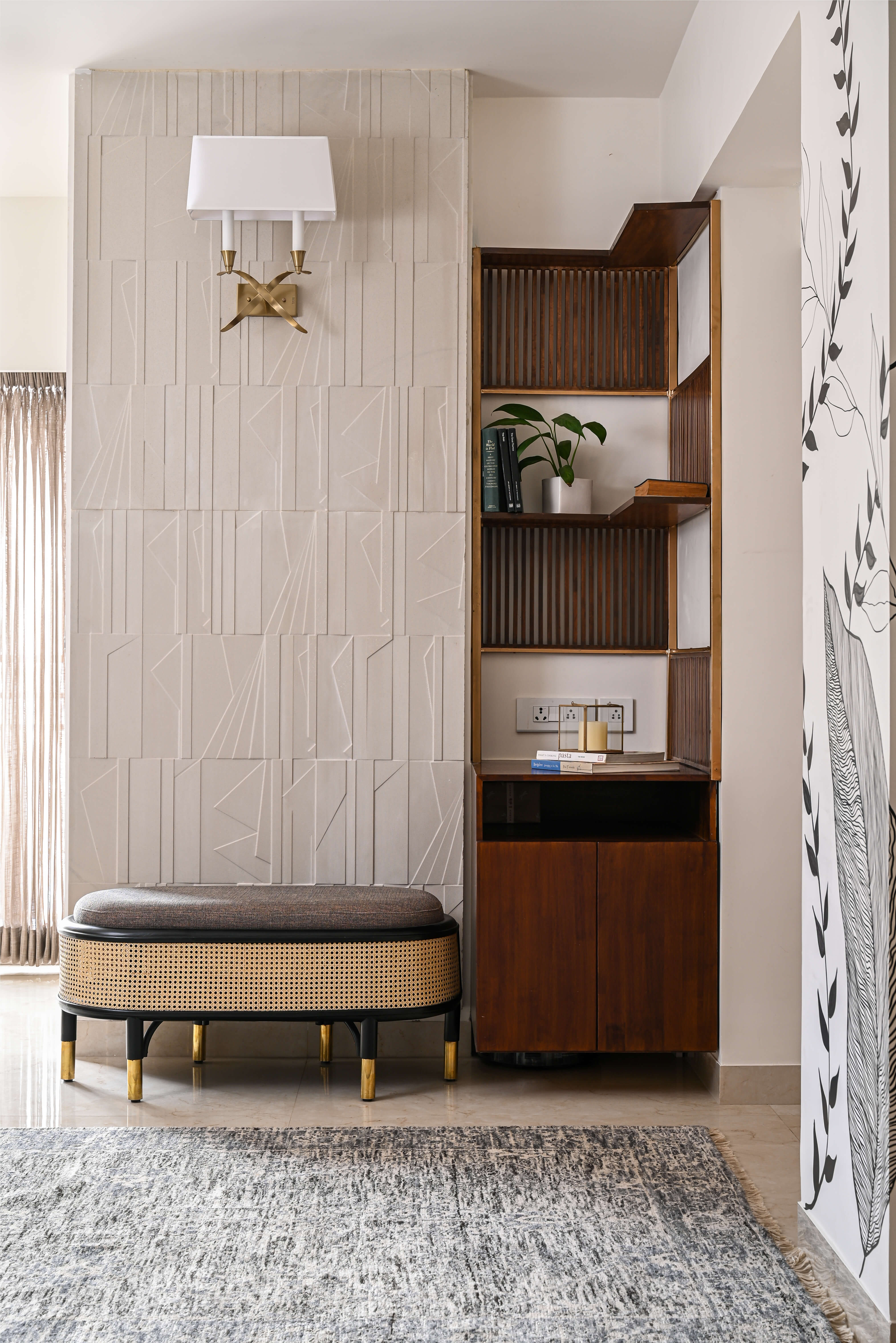
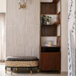
This corner of the house served functionality and aesthetics seamlessly. The wall behind the bench was a custom-made sandstone panel from Celes’tile. The cane bench with brass tips blended in with the furniture of the living room. The storage section to the right of the sandstone wall was made of natural wood. The pillar is highlighted by a hand painted mural that wraps all sides of the wall.
Dining
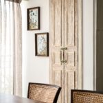
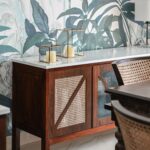
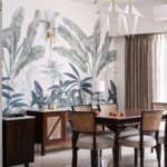
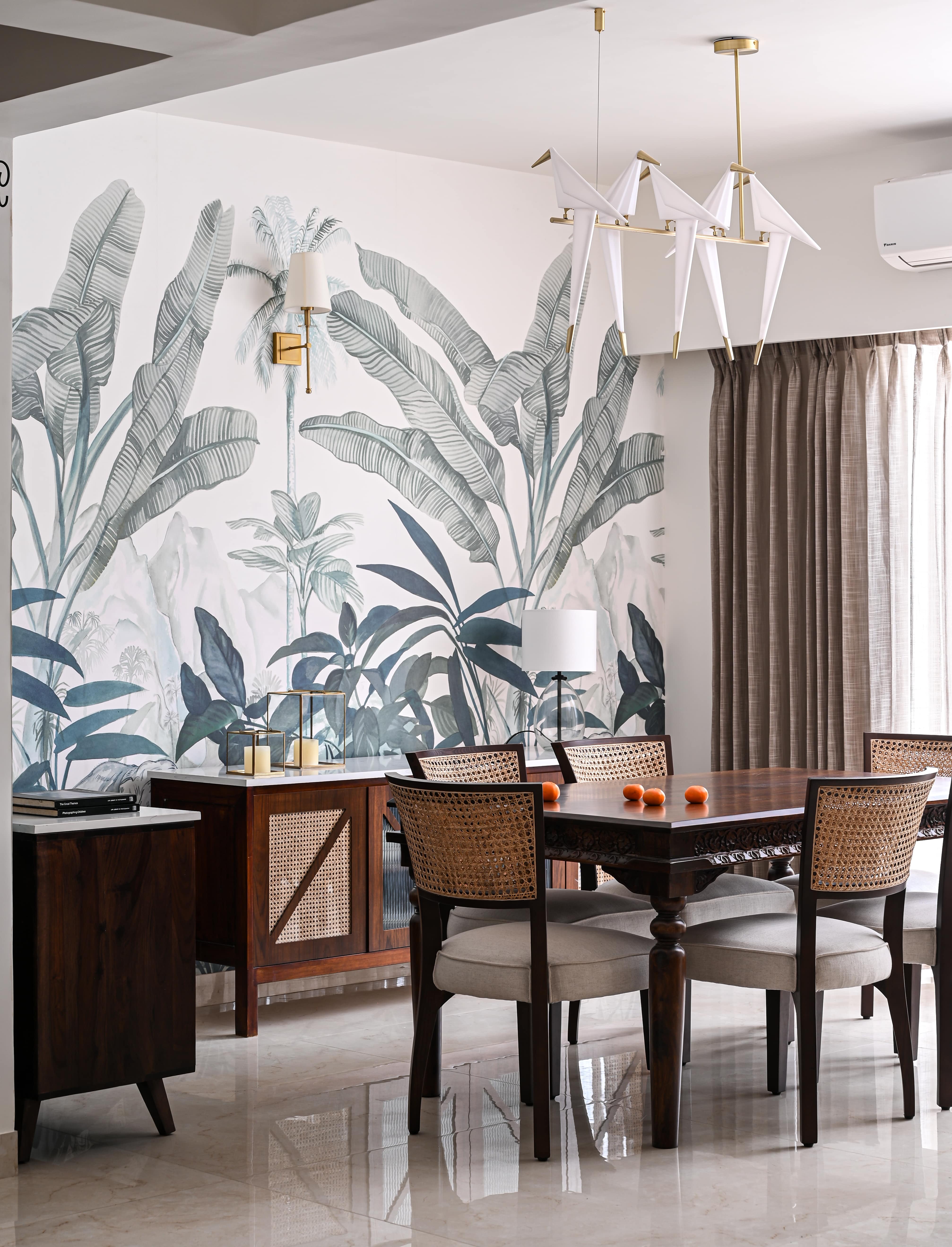
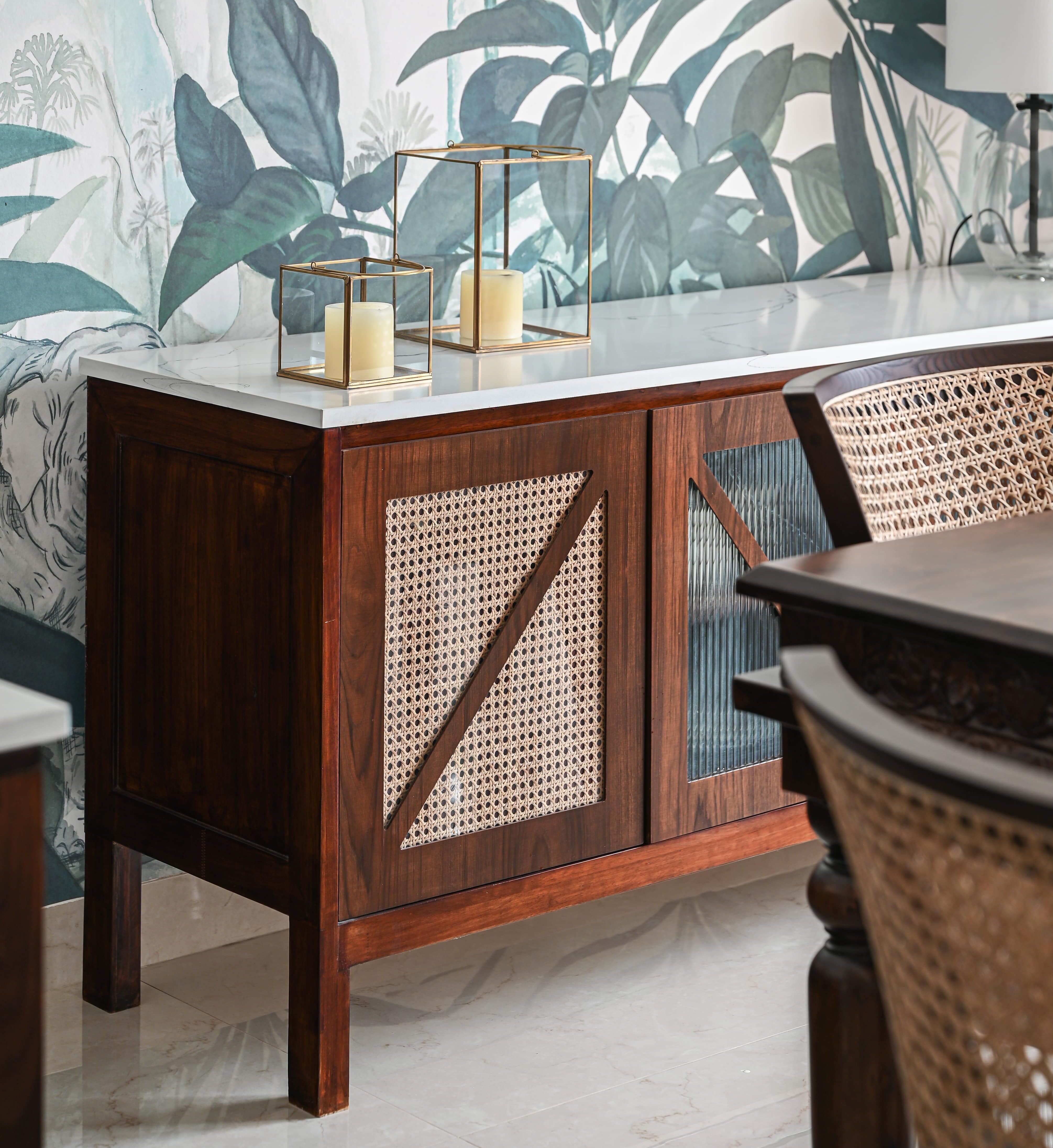
This area served as a refreshing tropical burst. Green-hued wallpaper wrapped both the adjoining walls. The dining table, which had detailed carvings and tapered legs, was repurposed and paired with the antique and modern cane chairs. The custom-made buffet cabinet was designed to suit the rest of the furniture.
Powder Room
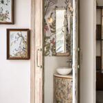
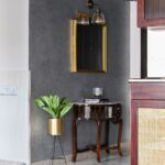
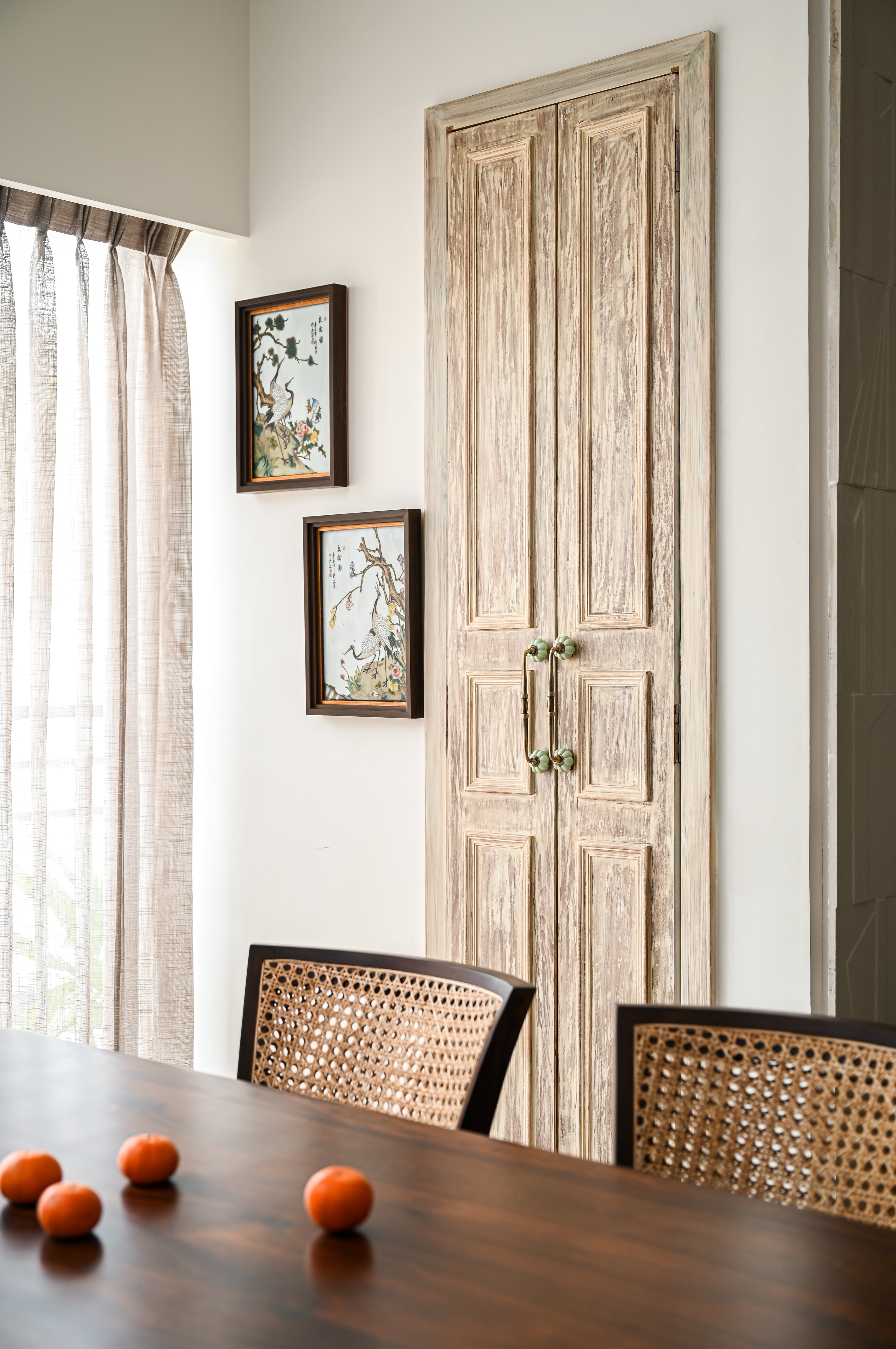
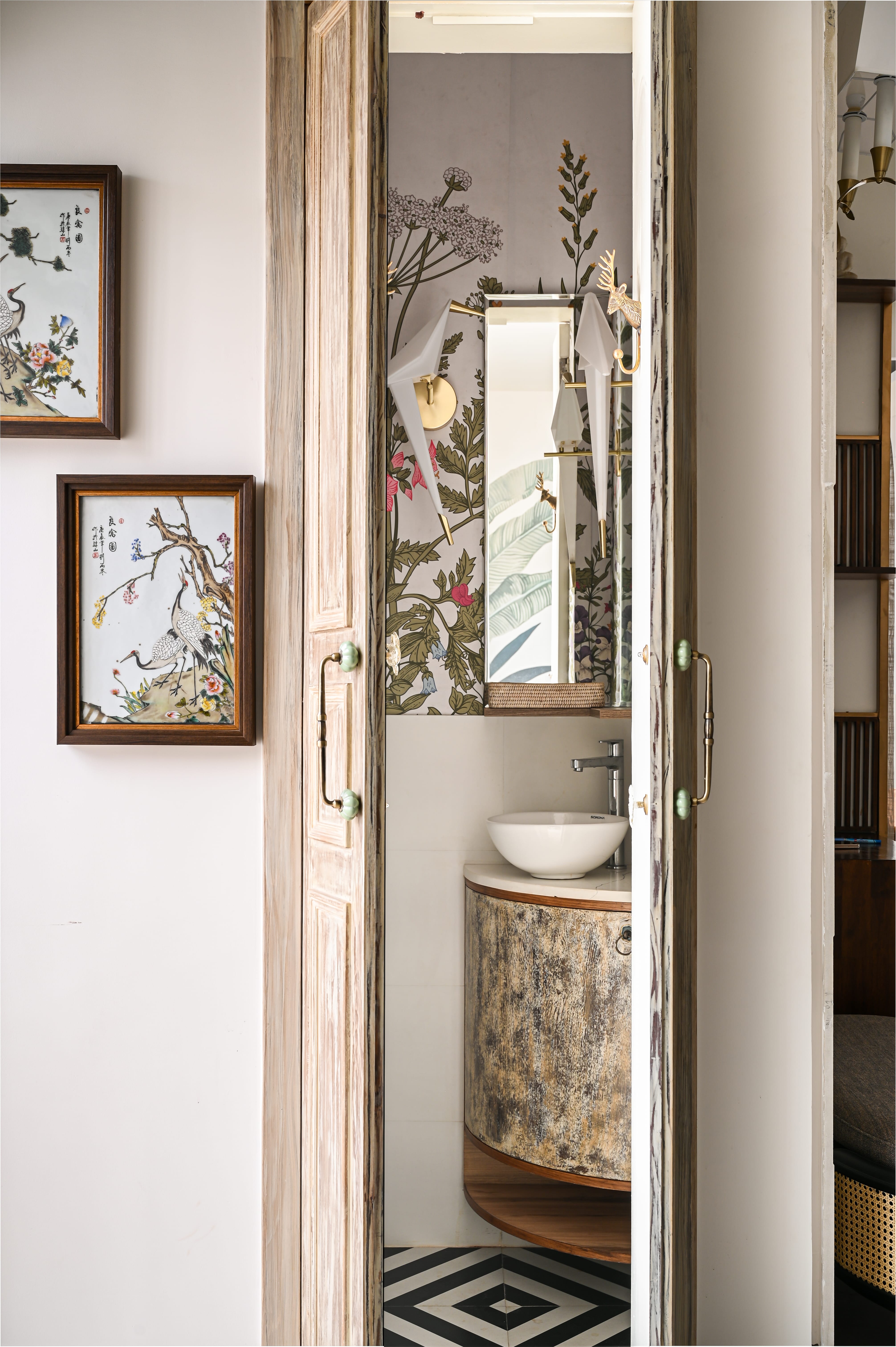
An important feature to add was a little powder room as the client regularly hosts. A distressed finish matched the soul of the dining room, with handles complementing the Japanese-inspired artwork of tiles inside. The tropical theme continued into the bathroom but was bolder with the colour tones. Printed black and white flooring tiles were used, with wallpaper on all sides. The bird chandelier details on the wall were carried with an L-shaped mirror, harmonizing with the setting.
Living Room 2
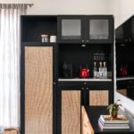
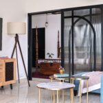
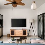
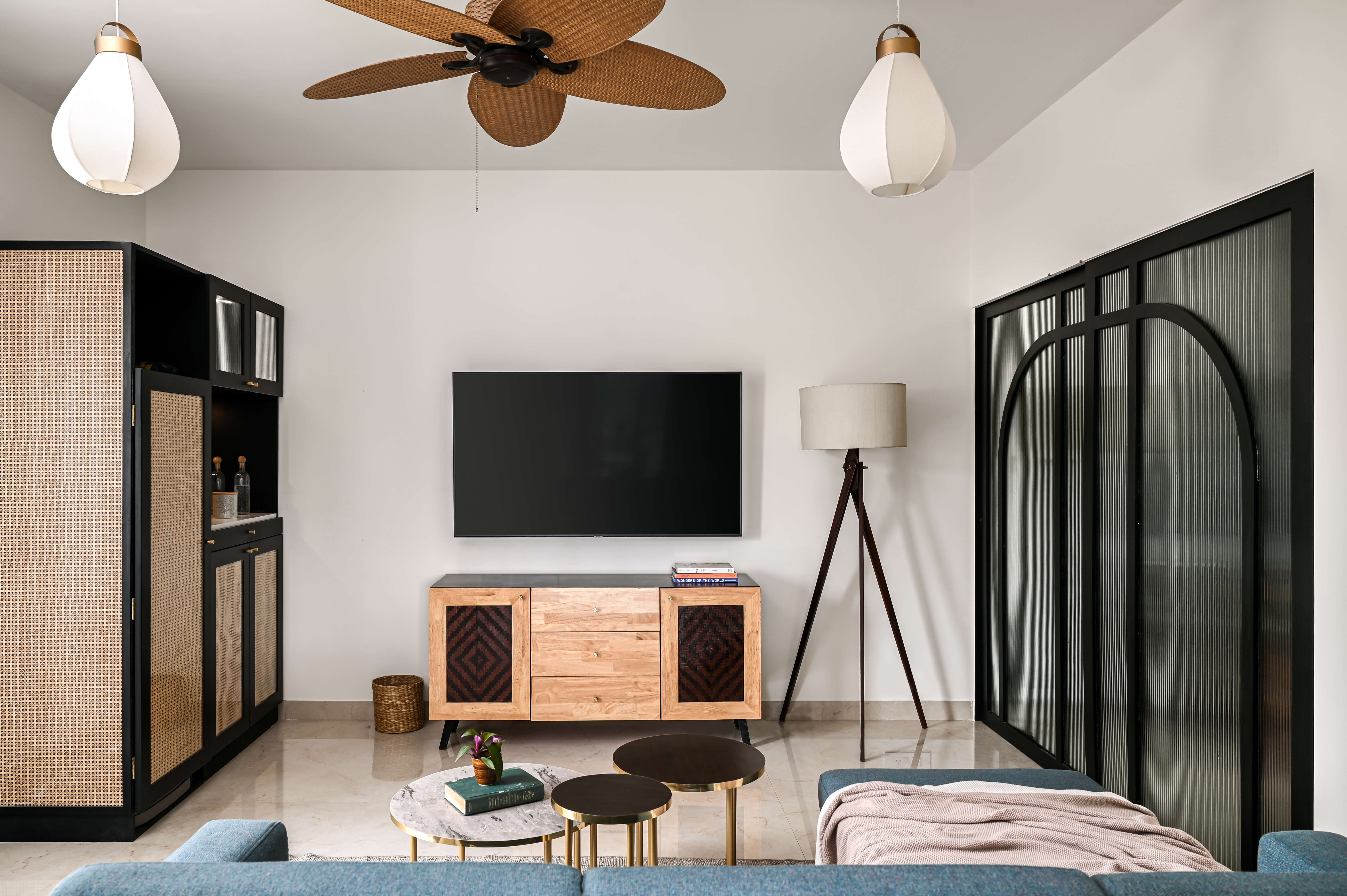
The first floor living room was meant to create a relaxing and casual environment. The arch on the right panel was a sliding door which opened to a guest bedroom and a study. The TV unit shutters were made from the striking surface of a match box that was passed down generations. The hidden bar in this room had a cane finish and served as a pantry and fridge.
Kitchen
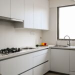
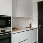
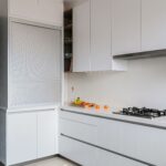
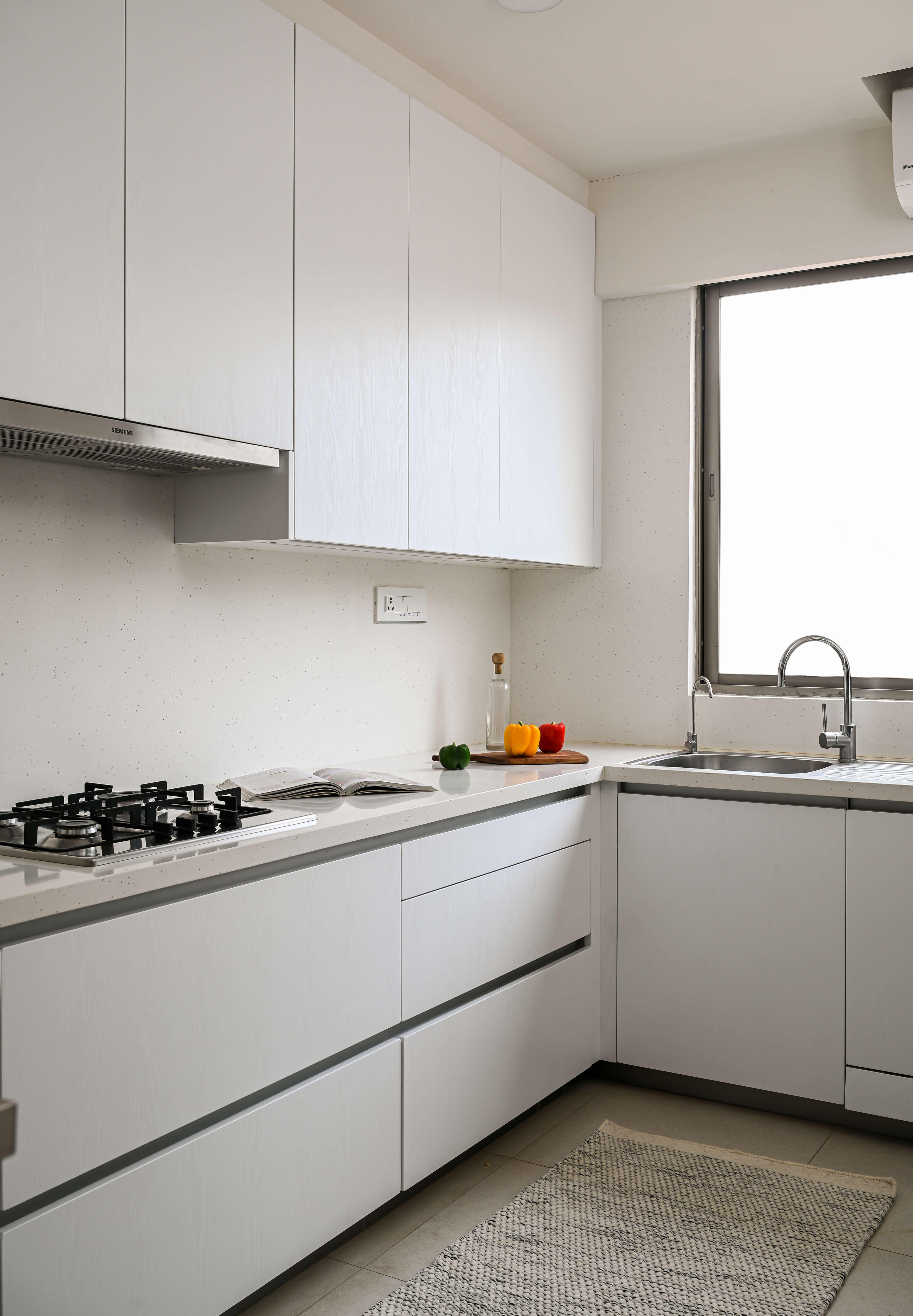
A minimalistic approach to the kitchen was taken, inclining it to a contemporary, contrasting and clean space. It had all the modern essentials for one’s kitchen needs. Enveloped in white, this space was designed to be mainly functional, while also serving as a contrast to the rest of the house.
Bedrooms
Each bedroom was designed with purpose, and to stand out. All the rooms were inspired by the client’s love for travelling.
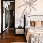
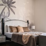
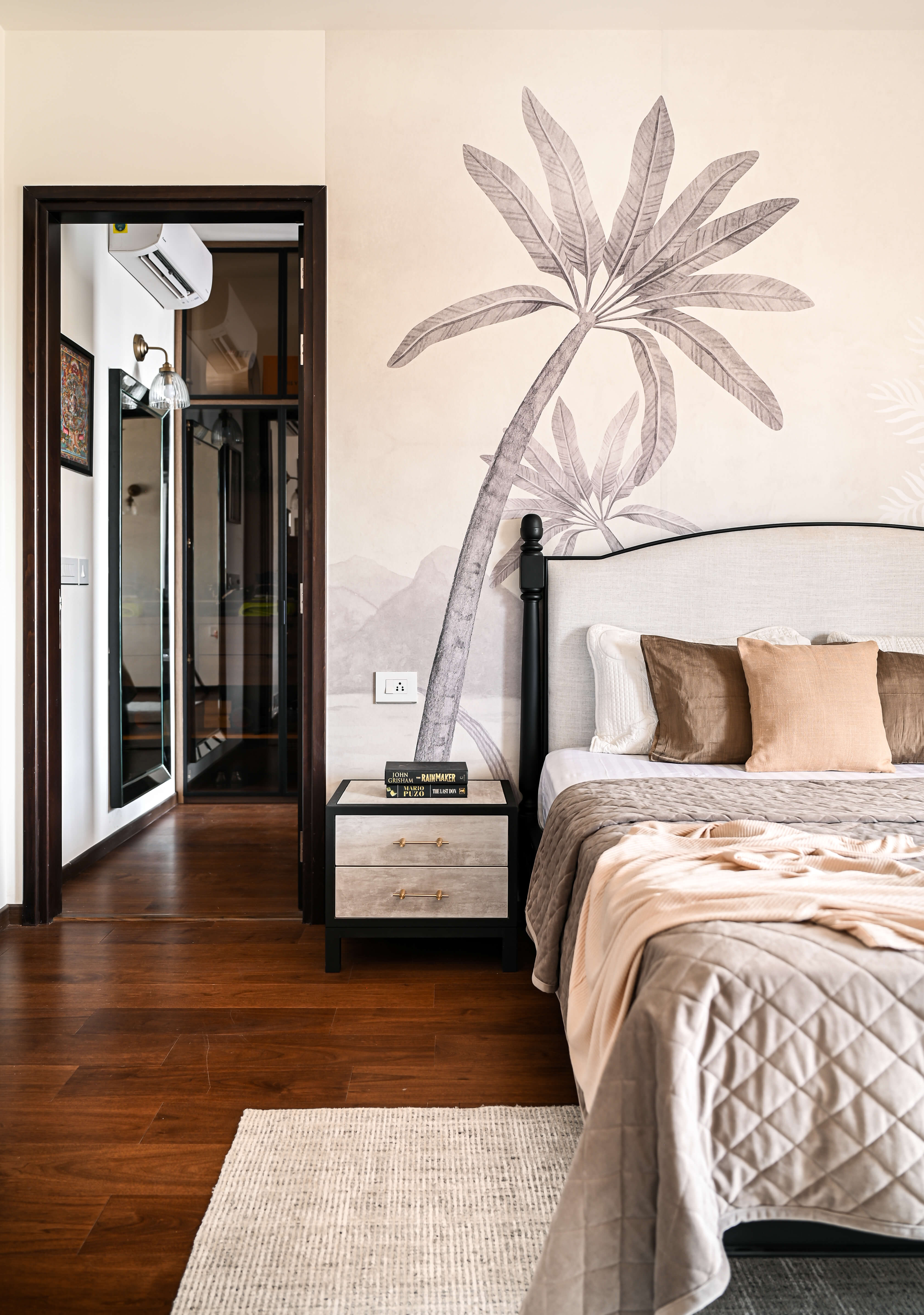
Bedroom 1 – Primary Suite: This room was designed to induce a sense of calmness by also providing an international look. The space presents a mix of a few styles across various aspects, but still remained neutral. The furniture was contemporary, and the walls were painted floral – a mix and match of styles finished the room.
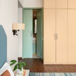
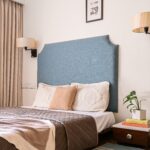
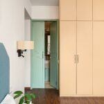
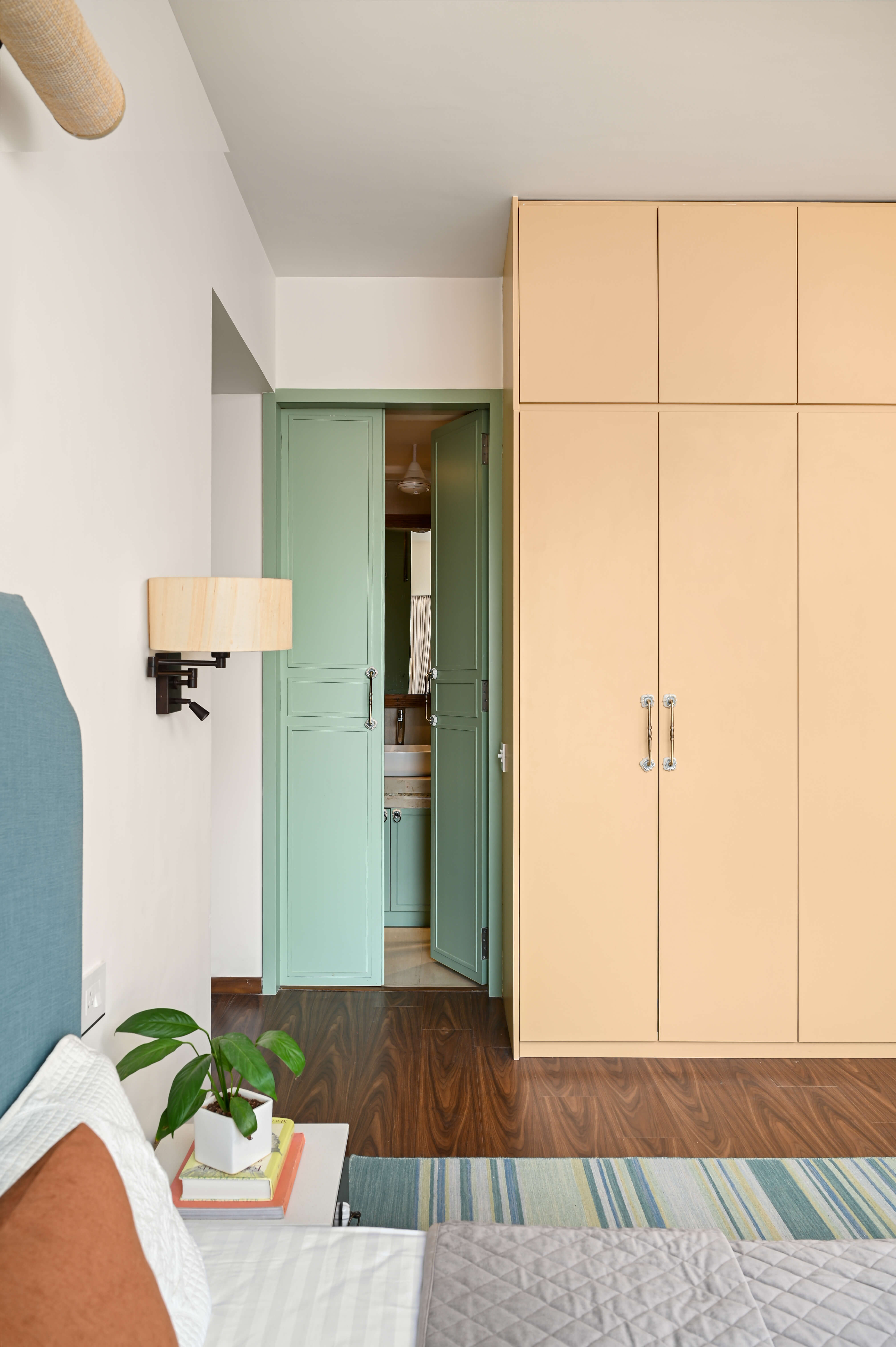
Bedroom 2: This room aimed to be different and colorful. Inspired by the client’s walks in Pondicherry, the yellow wardrobe, green door, and blue headboard work together to provide a colorful contrast. A cheerful and bright aura carried the room.
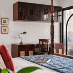
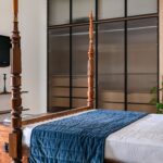
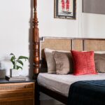
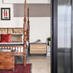
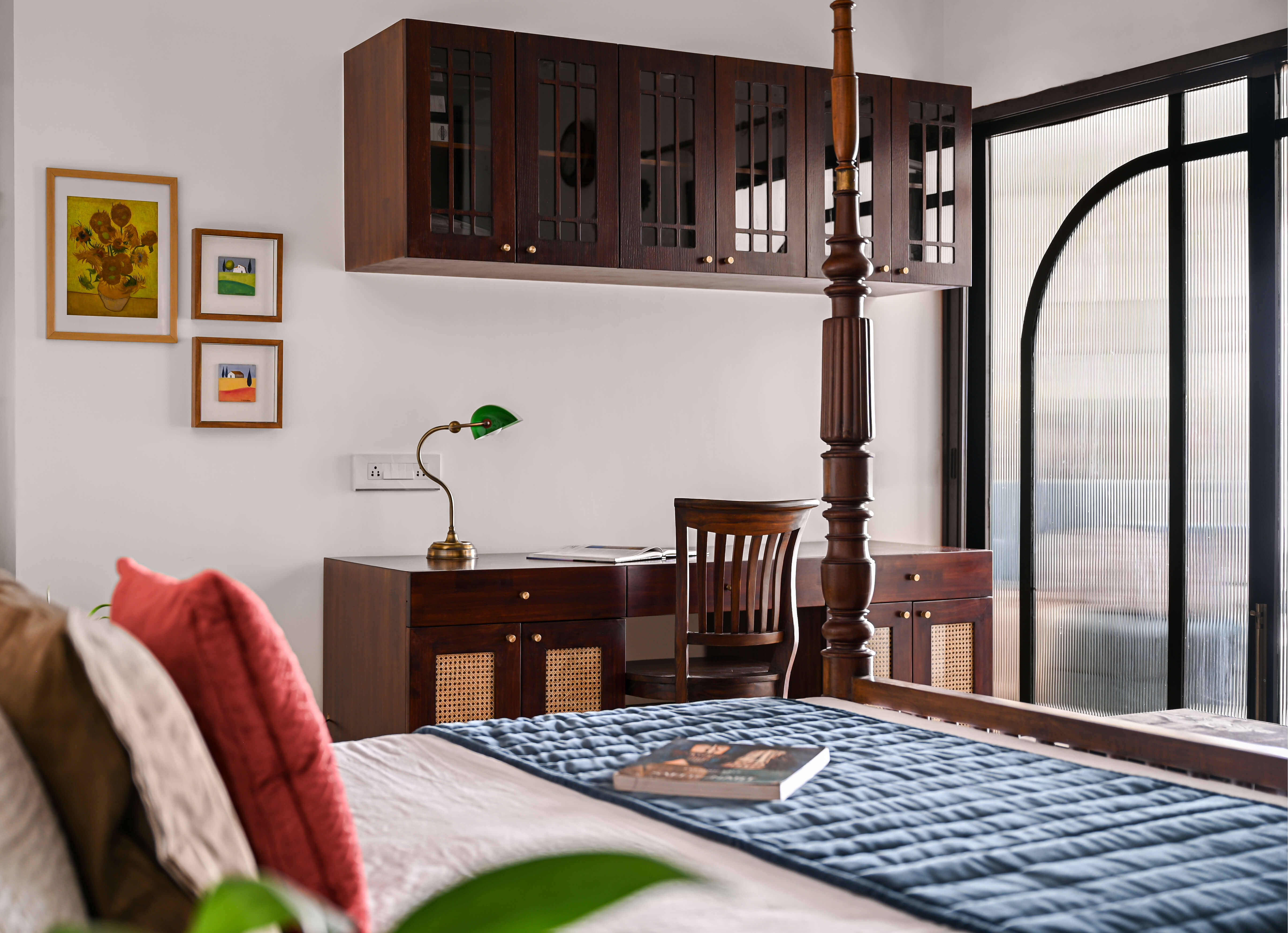
Bedroom 3: This bedroom captured the concept behind the house – taking a bold approach to merge the old and new. The bed was an old family heirloom - the original headboard was taken out and a new one was designed and replaced. New bedside tables were added to tie in with the wooden bed. The chest in front of the bed was a vintage piece. The red artwork on the wall paired well with the rug and cushions.
Staircase
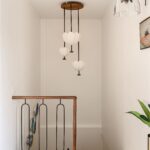
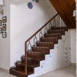
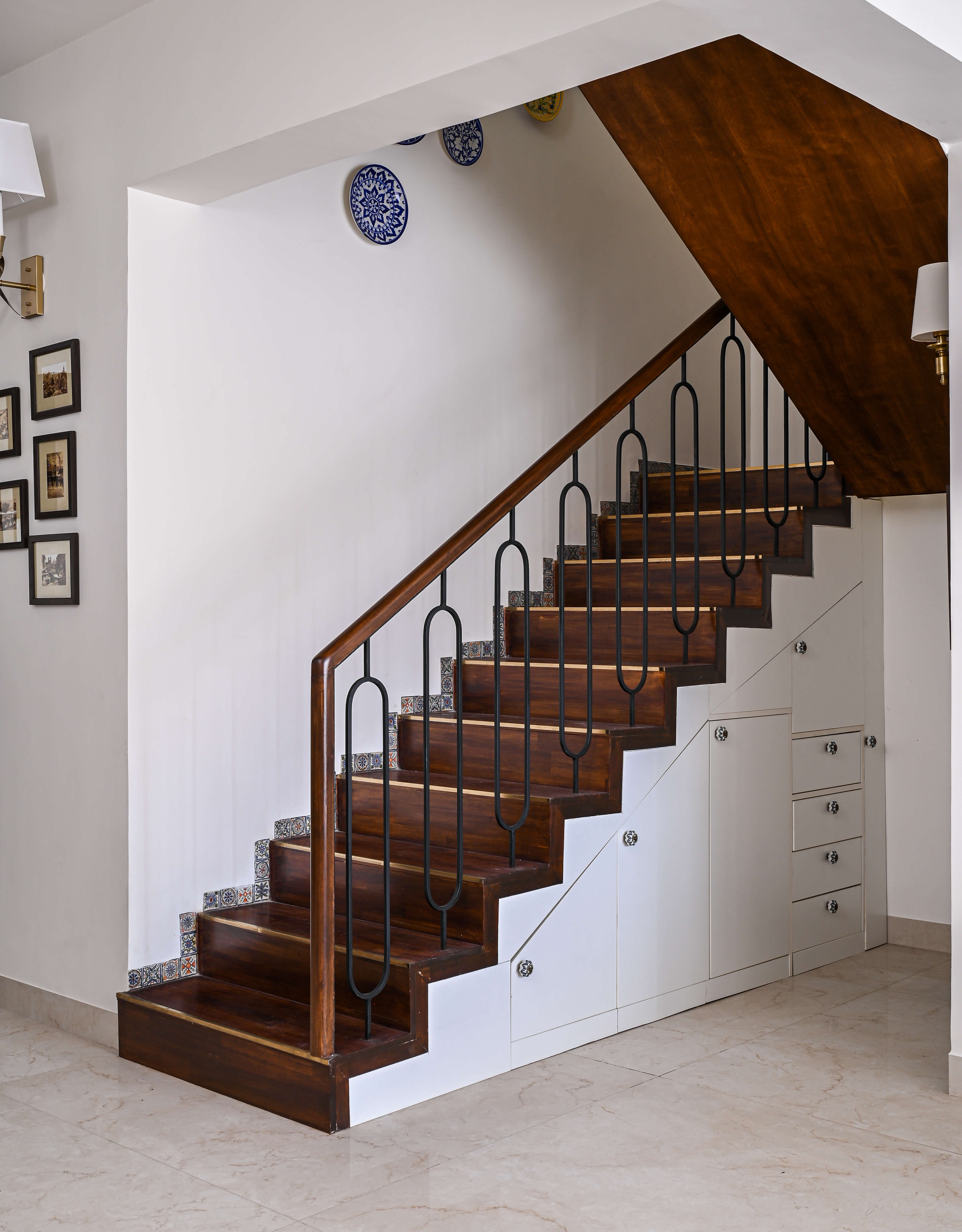
Almost everything in this project was a thought of togetherness – every detail was planned. Storage and practical spots were included to provide convenience for the client. The spandrel under the staircase was utilized for storage purposes. The railing and banister were custom designed with a dark woodwork finish. To match the knobs on the storage, tiles for the skirting were chosen – also matching the plate print that hung on the wall. The landing features paintings from the client’s father along with drop lights hanging like chandeliers. Custom-made lights matched the material of the railing and banister – providing a simple yet elegant look.
Terrace
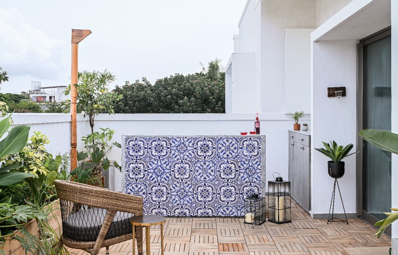
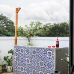
The bar unit was a special addition – hand painted tiles from Goa created the façade of an exquisite outdoor area. The flooring was decked with natural furniture, creating a warm and welcoming feel. The wooden pillar with a teak finish on the left acted like a design element but is in fact a docking station for the awning.
