An Heirloom Home
Bengaluru
Residential
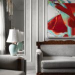
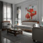
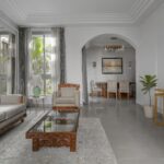
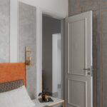
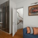
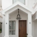
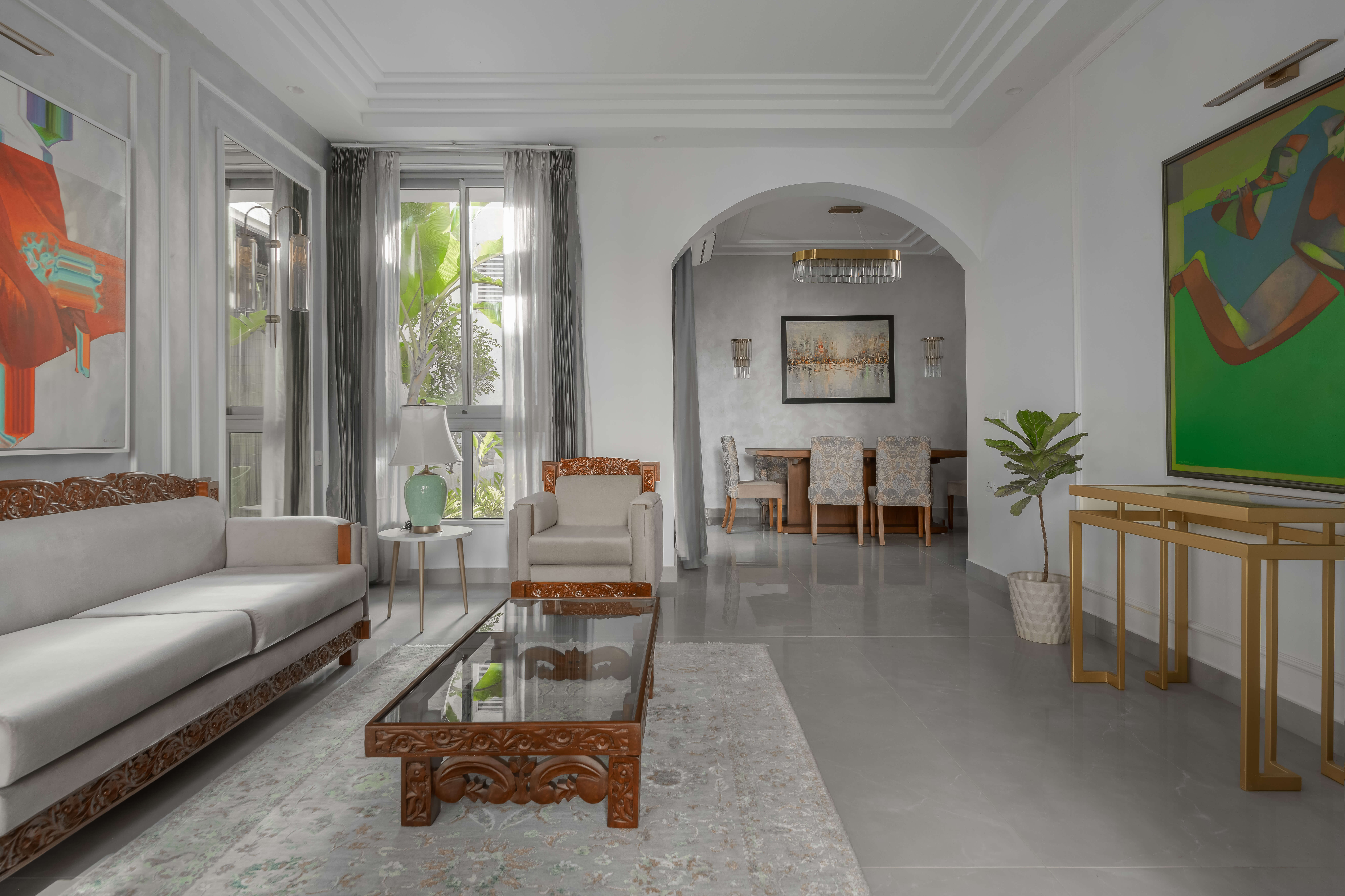
The concept driving this home was to blend timeless charm with contemporary elements. This was achieved through refurbishing heirloom pieces and incorporating them against modern artwork and details. A challenge faced was to merge very traditional pieces with a modern interior, along with using glass, mirror and brass without overdoing it! Modern artwork was used to contrast the areas where the furniture was a bit traditional to create a strong juxtaposition. Not a lot of decor was used for this house, instead existing pieces owned by the client were used and curated through the house. For the décor lighting a similar colour palette of brass and glass was used.
Staircase
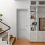
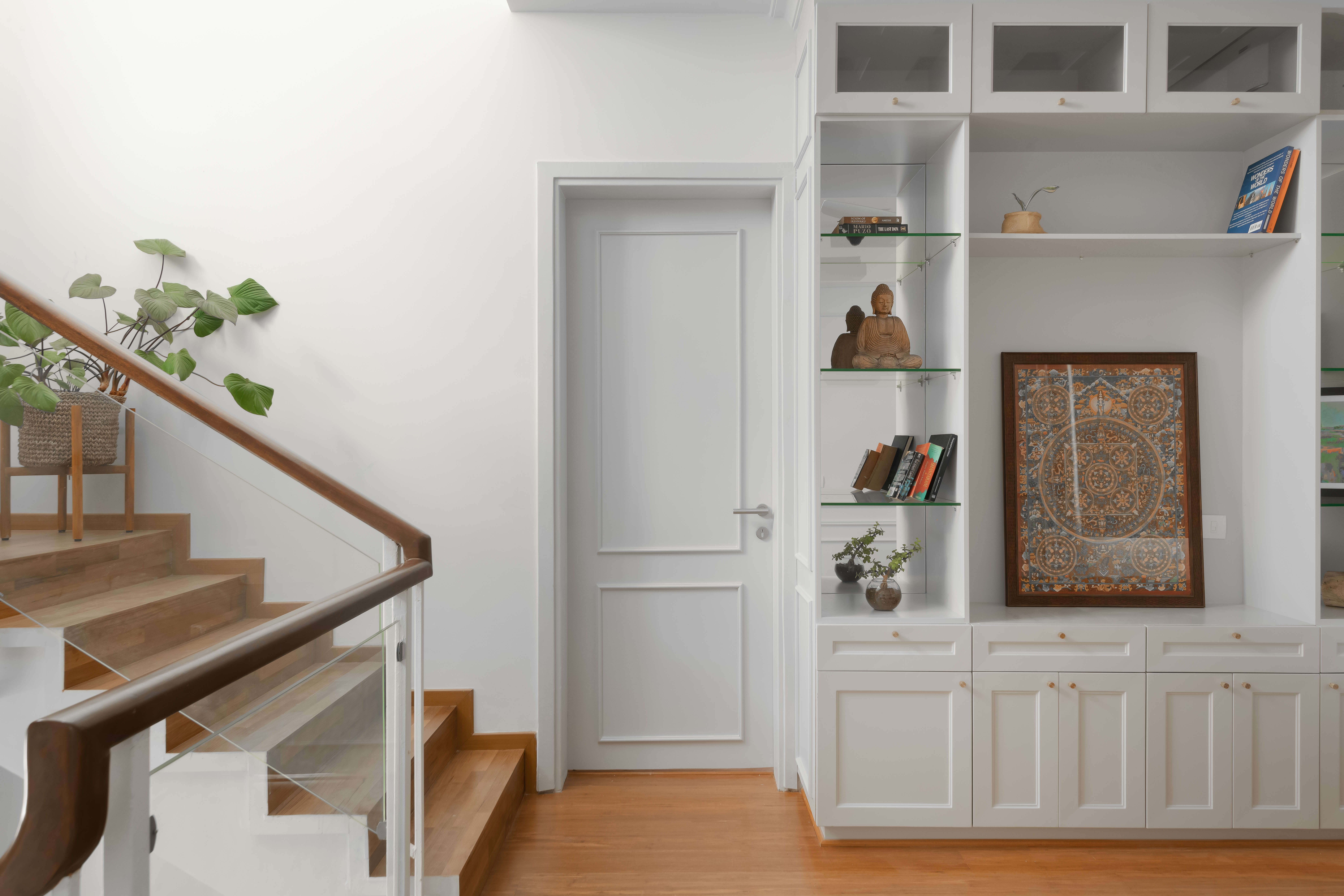
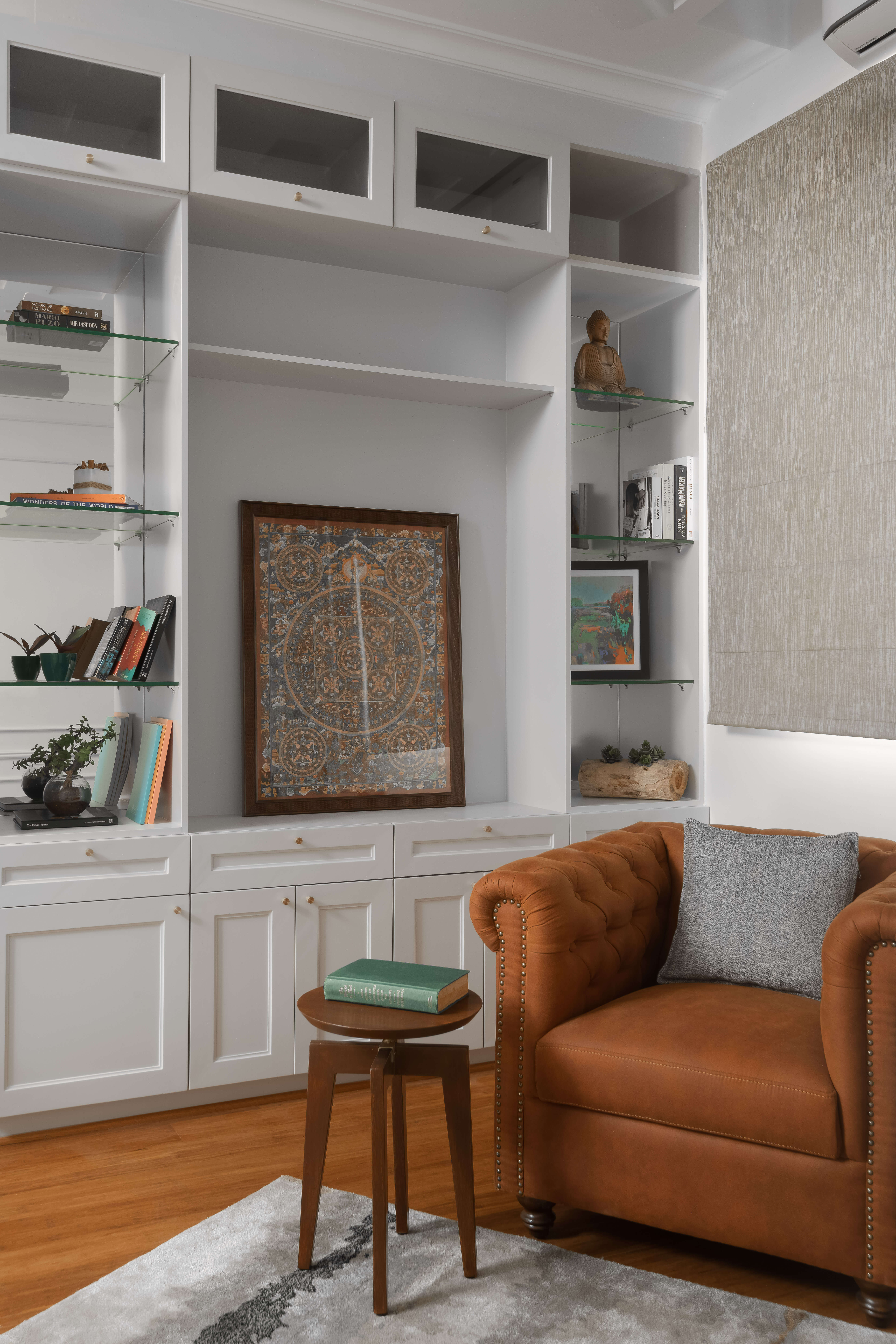
The staircase was also refurbished. Wooden stairs were added in, and the polish was stripped of the banister to highlight the original colours. The landing next to the staircase was converted into a study area. It was the apt opportunity to incorporate a large bookshelf for the family to store various knick-knacks and pieces of art. To transform the space from just a landing to more of a room, a study table and chair were incorporated. Complimenting this was the statement piece – a Chester vegan leather chair to create a luxurious study.
Study
The study on the first floor. We took the landing (a space which could be easily forgotten) and converted it into a study/work from home area with a large bookshelf. This way we utilized the space into something functional.
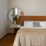
In terms of texture and Colour – we used very few pops of colour through the house focusing more on neutral textures and metal accents.
Heirloom
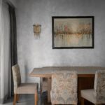
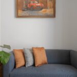
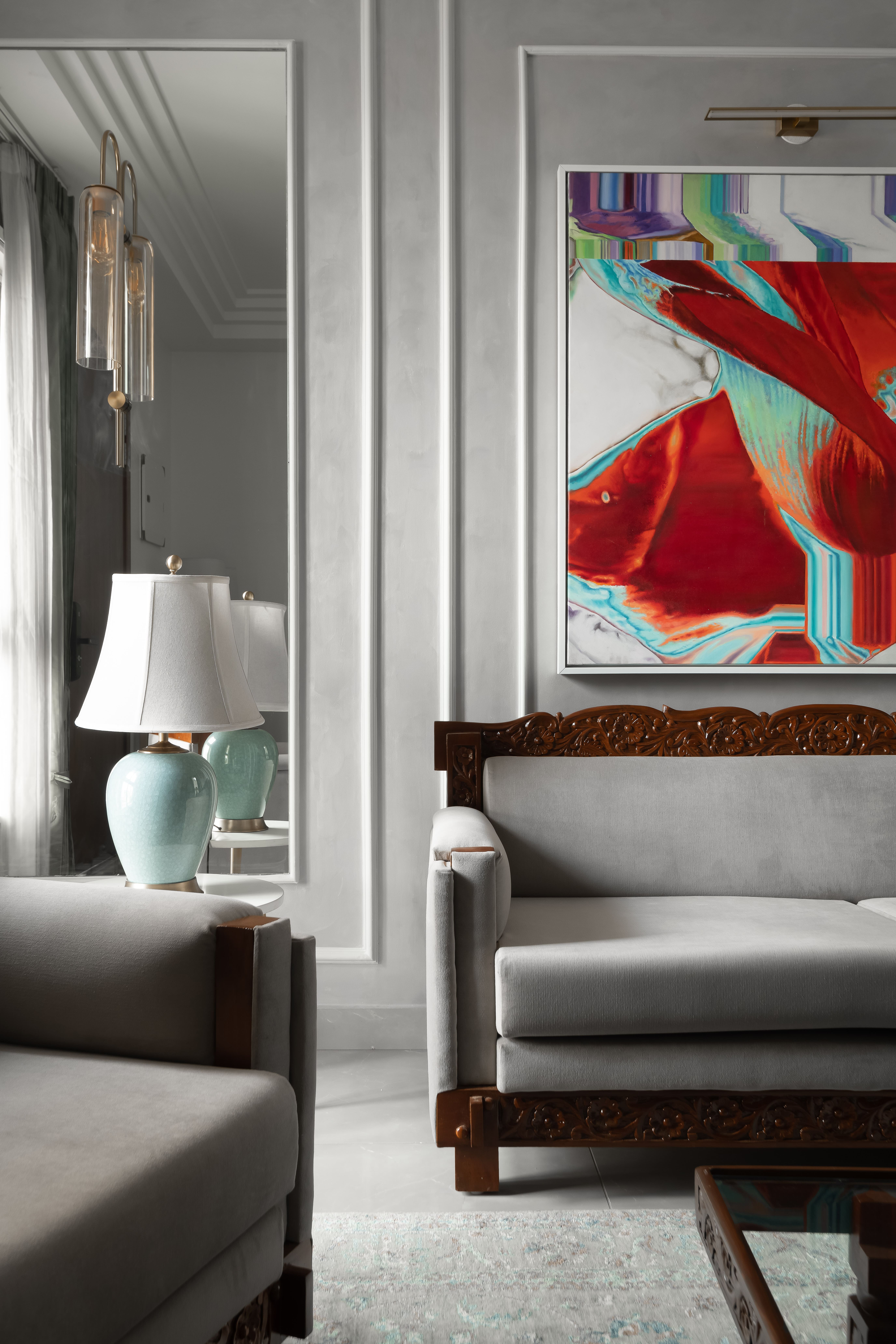
This room was designed around furniture that had been made and passed down for the client from her father for her. These pieces of heirloom furniture were set against a large wall with a contrasting modern artwork. The walls had a cornice detail with a large mirror to open up the space and to add a design feature.
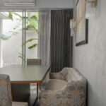
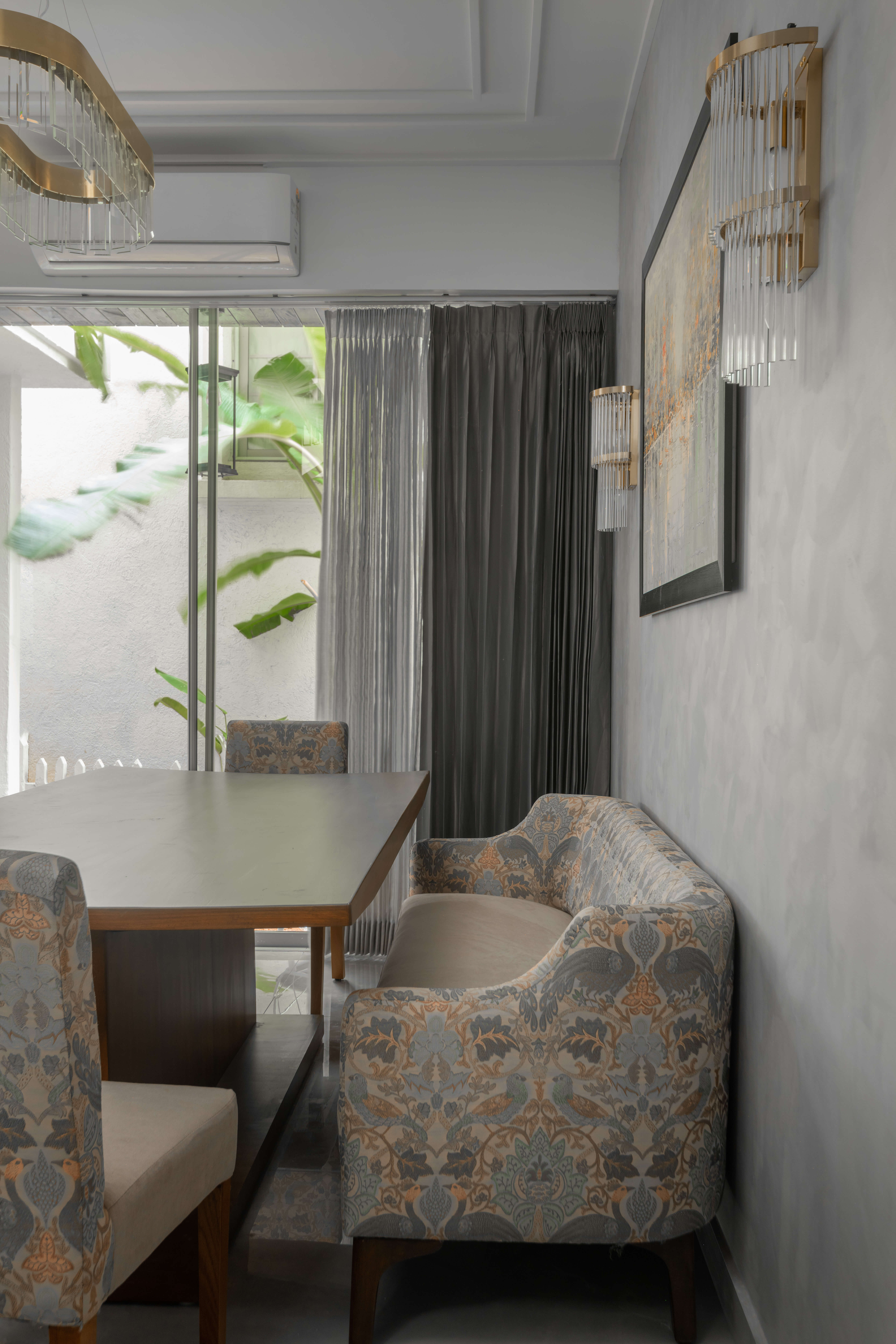
Considering a space limitation, bench-style seating was incorporated with the dining table to give it more room. The bench was pushed against the wall, allowing for space to accommodate four more chairs around the table. Dual fabric upholstery was incorporated on the seating, with the two varying fabrics lending to the merging of modern and traditional elements.
Kitchen
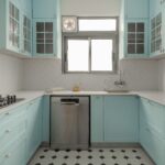
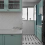
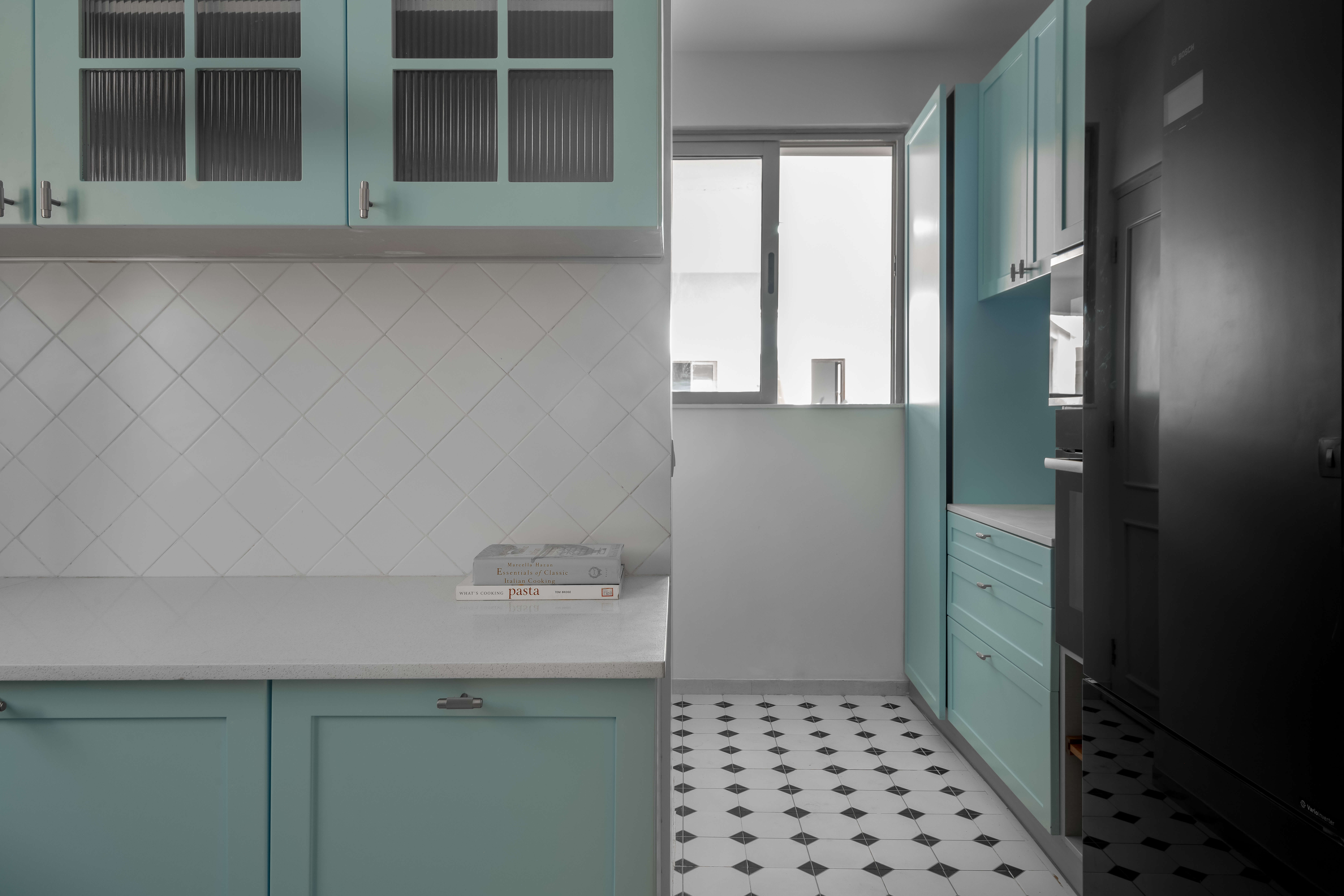
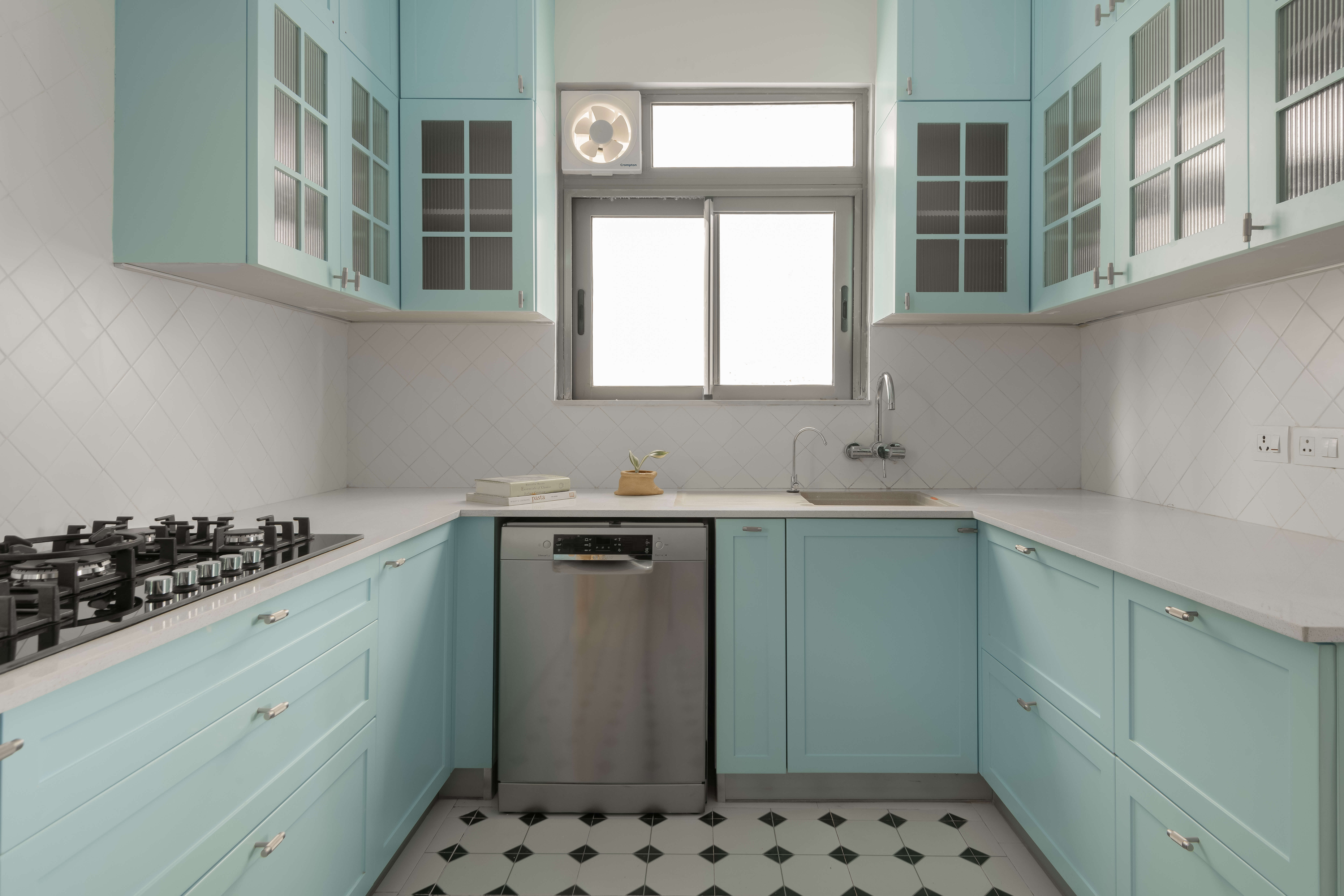
To give this kitchen a pop of colour, for the flooring we used black and white tiling. This was complimented with a simple white dado and countertop. Blue cabinets and ribbed glass on the upper cupboards were added to lighten the space. The kitchen was a contrast of new and old – with the retro style tiling and the more modern pops of blue.
Rooftop
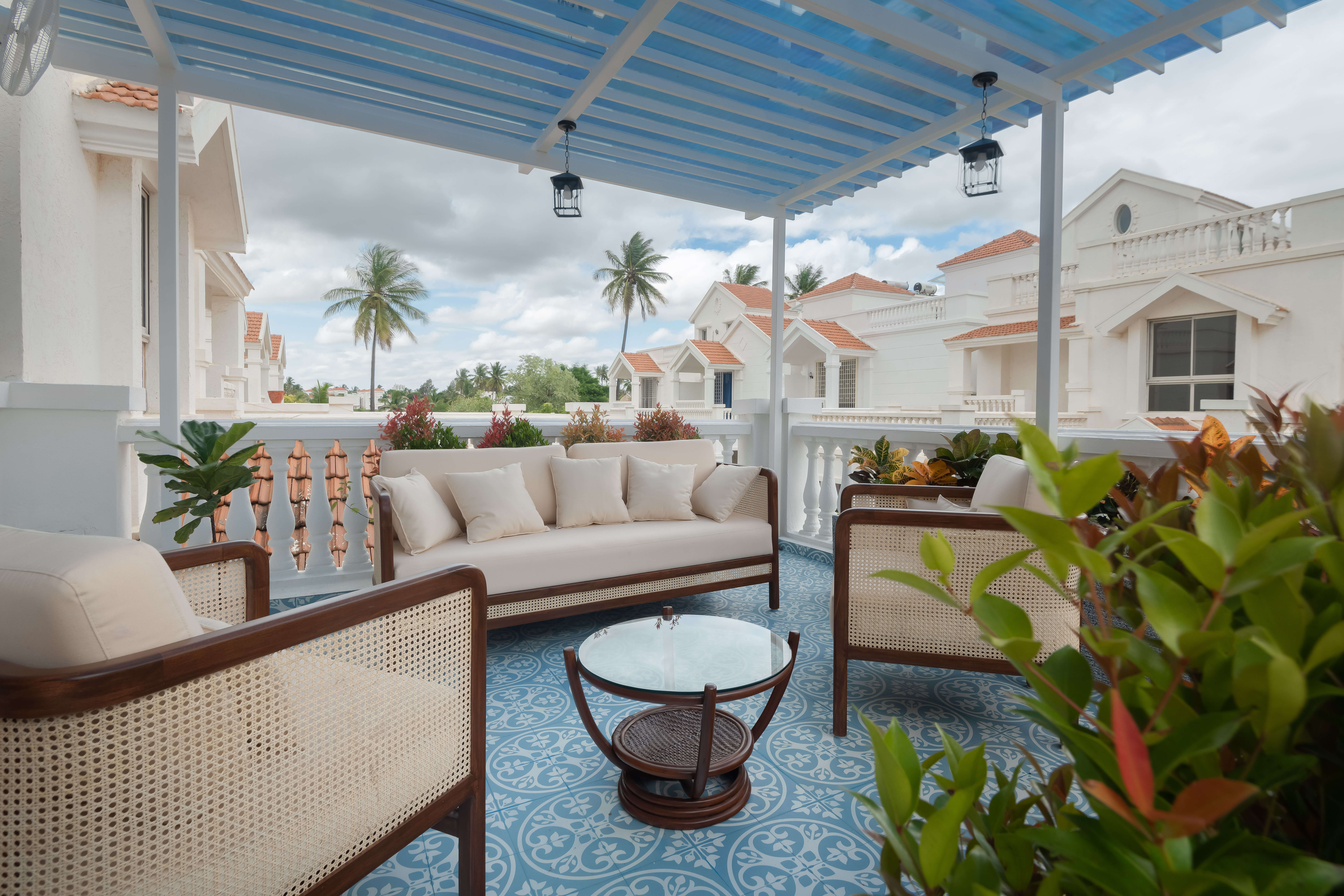
The rooftop was converted into an outdoor living room – with tiles accentuating that antique feeling. The blue and white combination keeps the space light and open. A break away from the city, this terrace adds a breath of fresh air. The furniture used here has cane elements, adding a touch of history.

