Skip links

Apt. 4020

Bengaluru

Residential

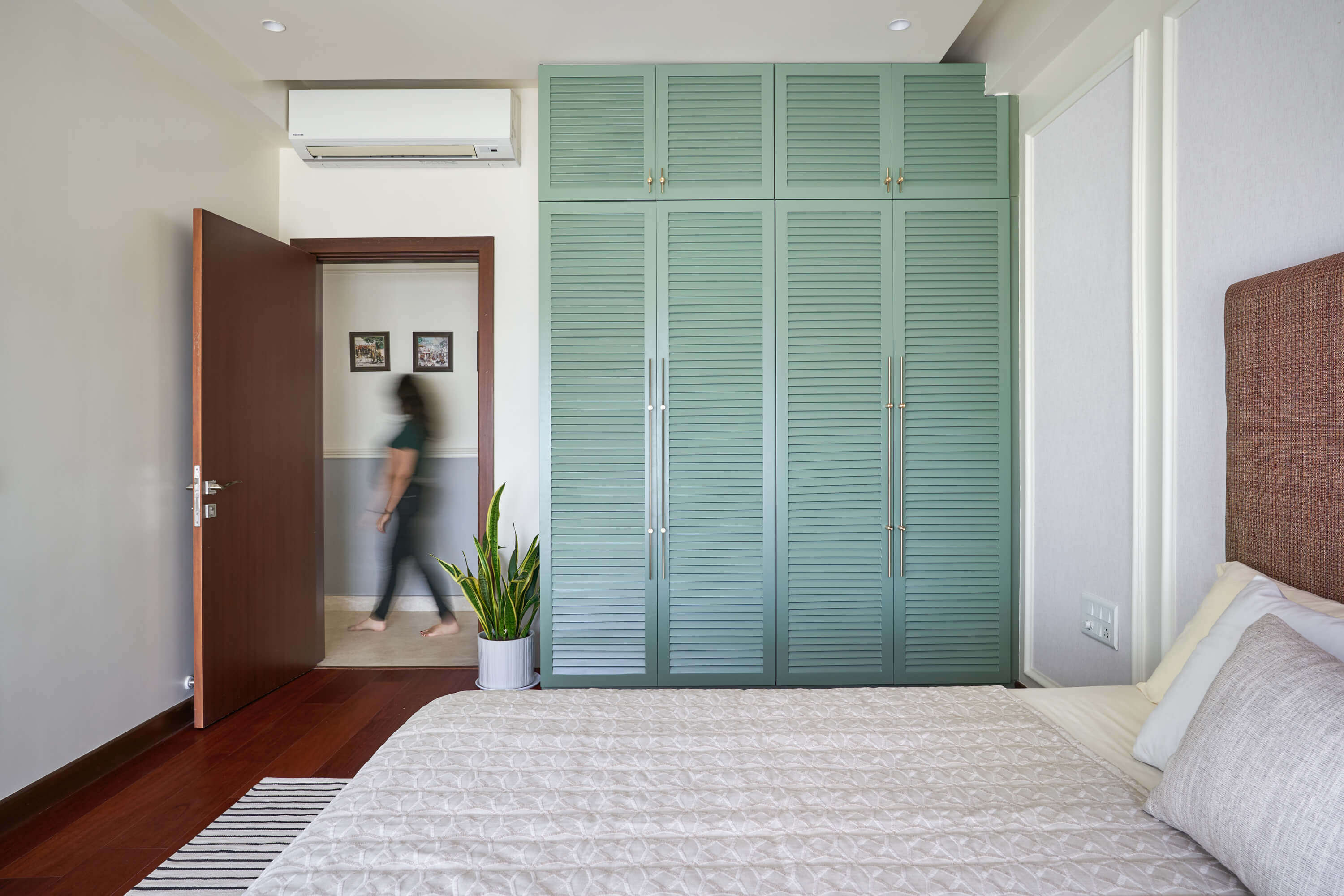
While monochromatic tones may be growing in popularity, adding a pop of colour to homes is still prevalent. Young homeowners, especially, are looking for brighter and bolder elements to incorporate into their homes. One of our recent projects in Bangalore involved transforming a house into a playful and bright space full of colour.

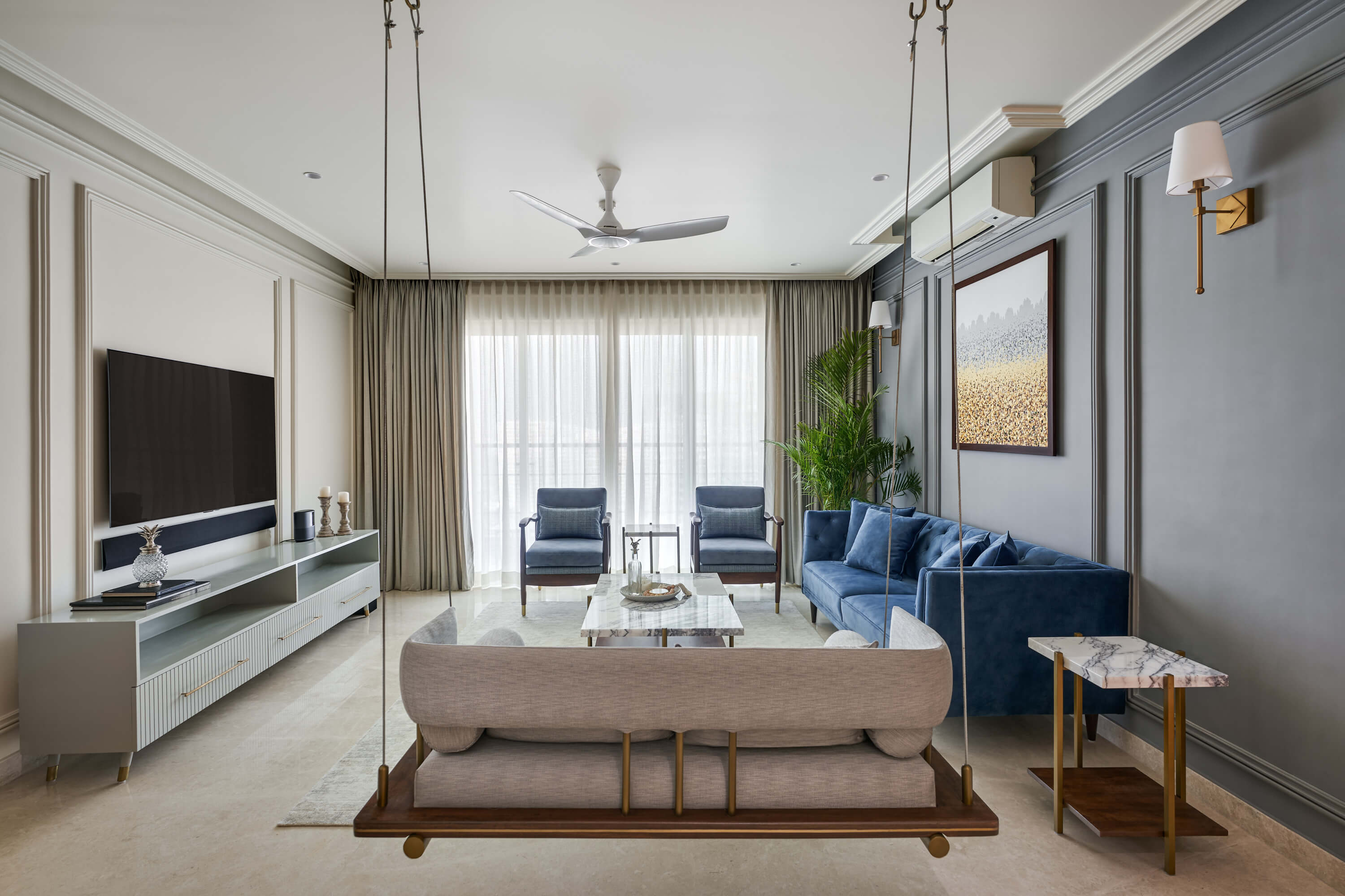
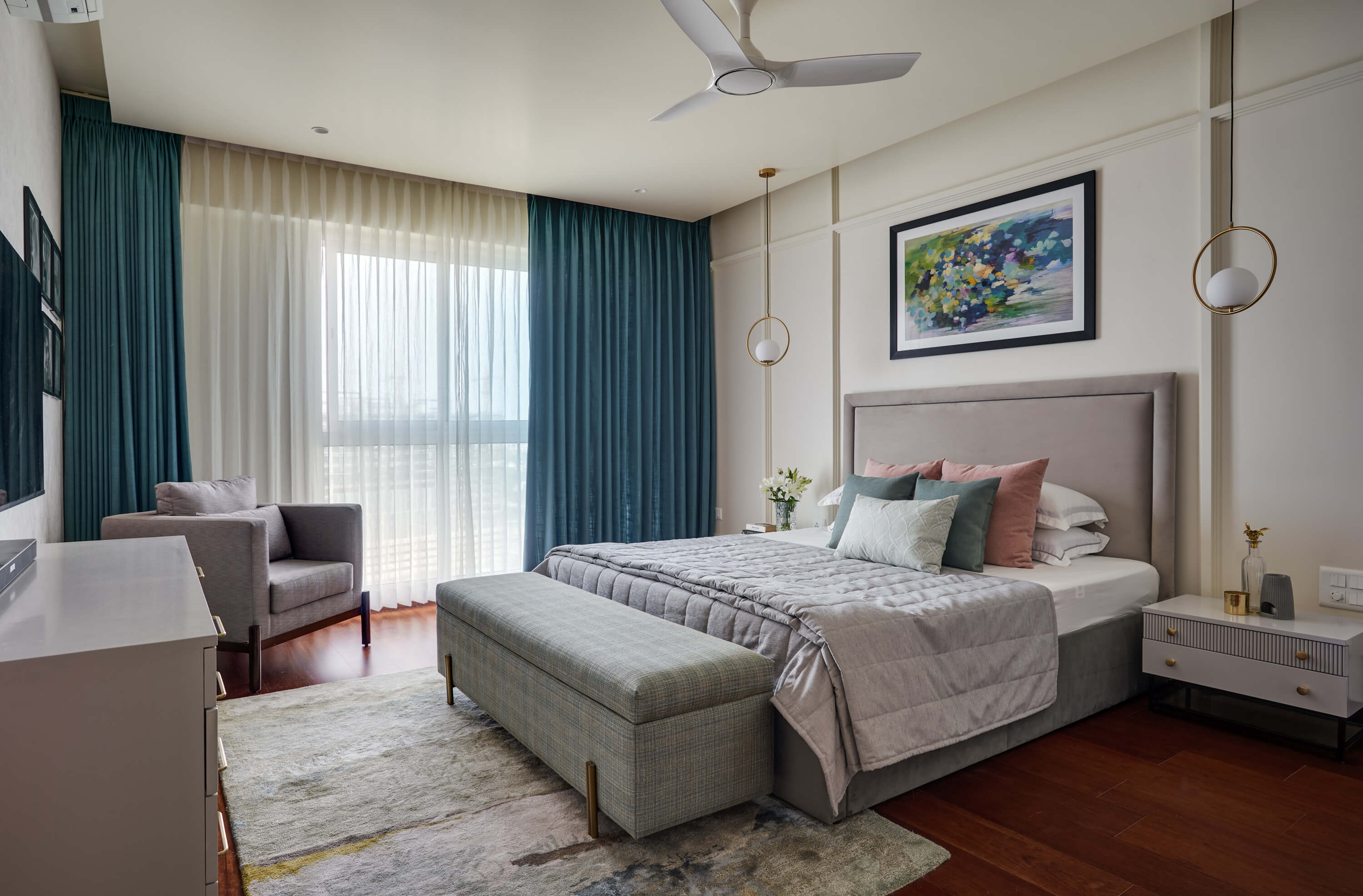
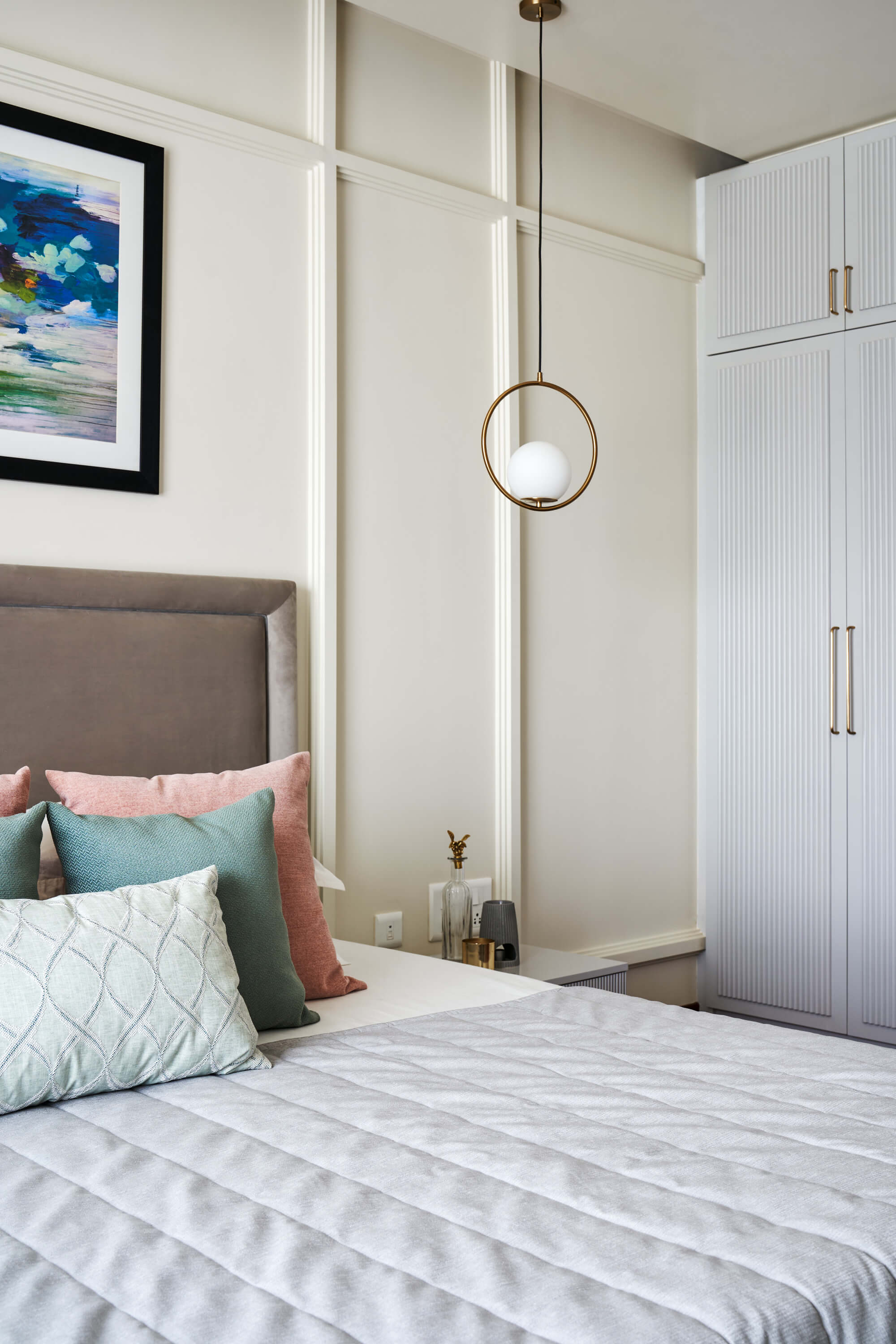
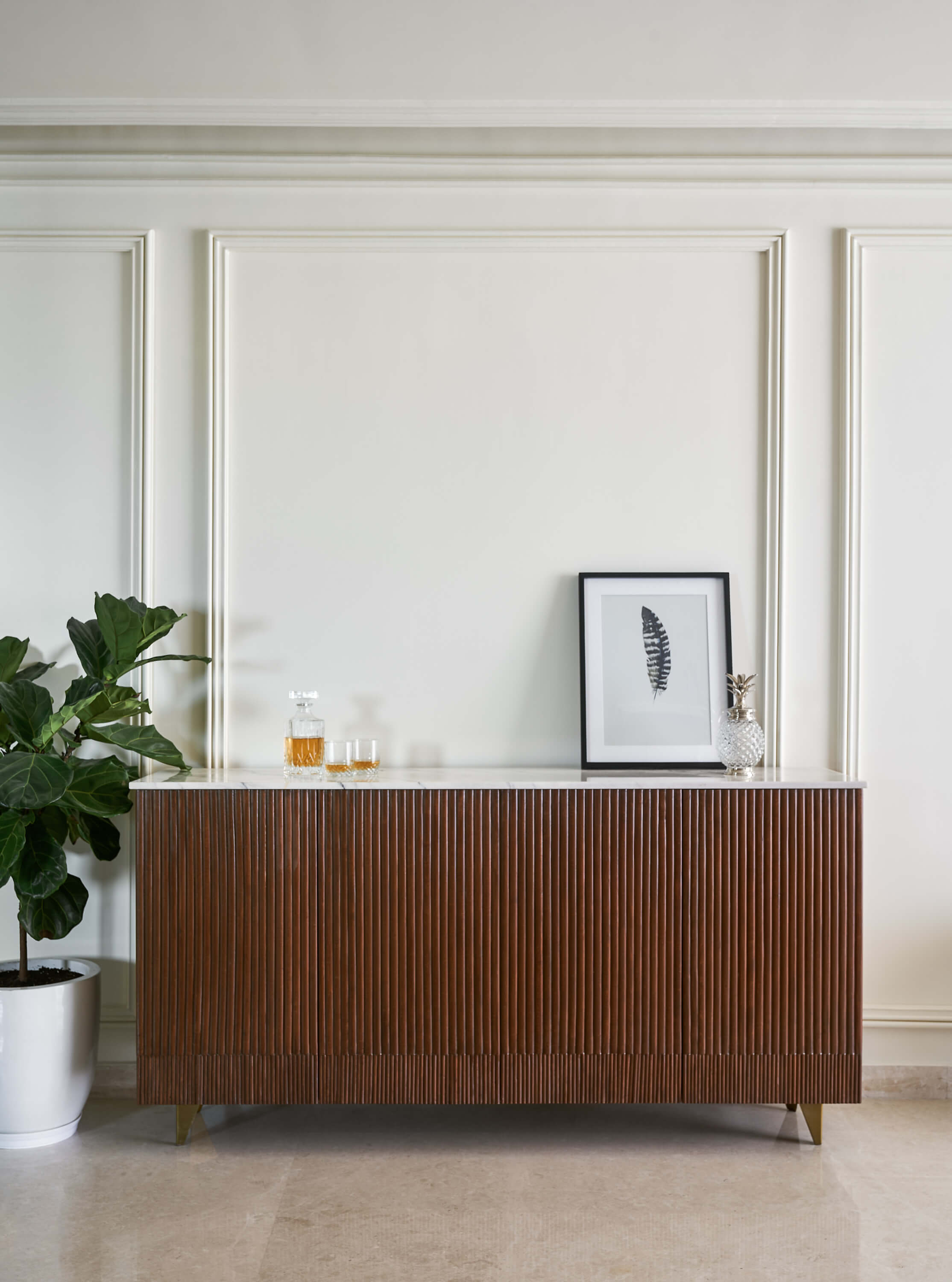
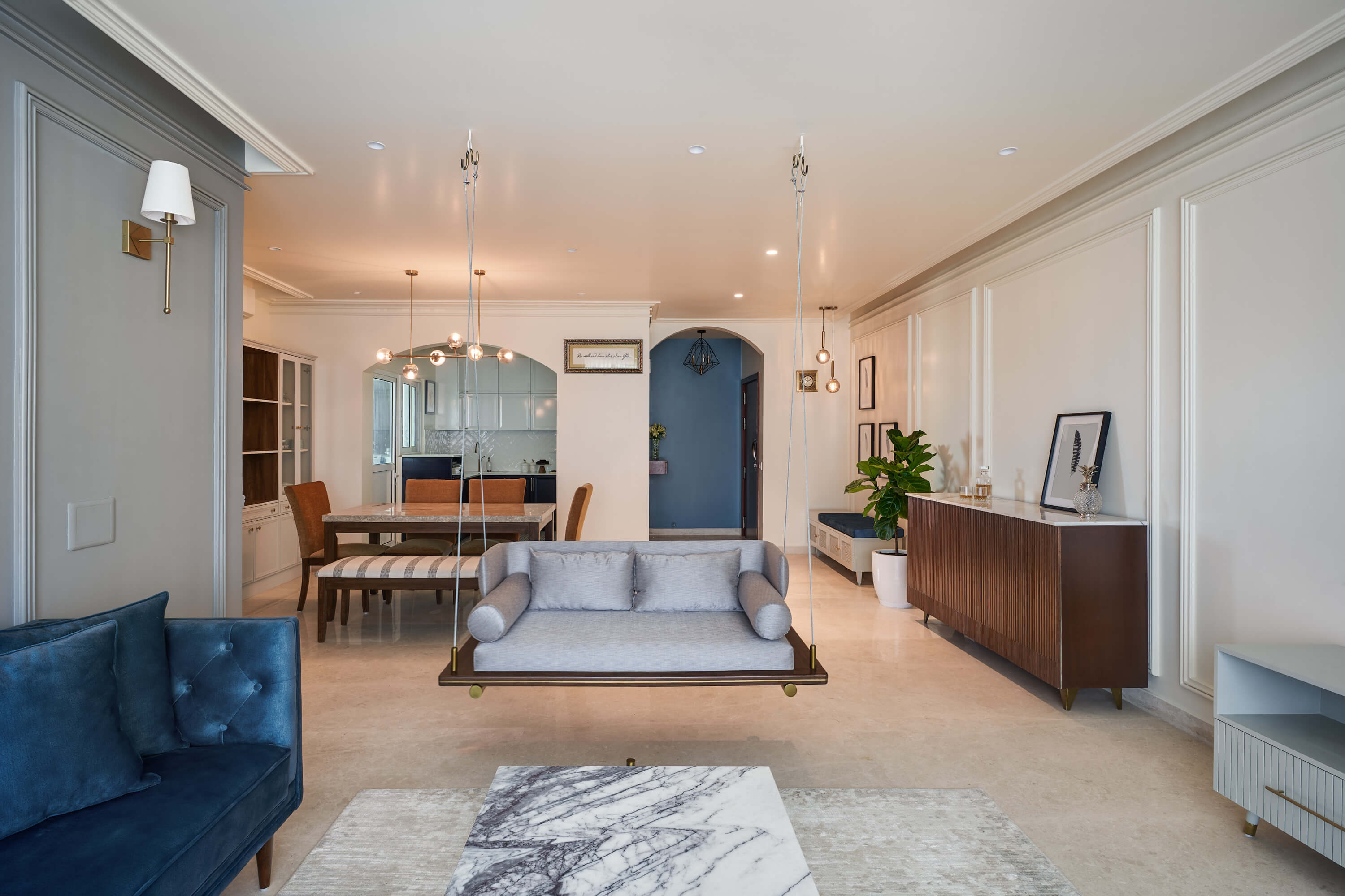
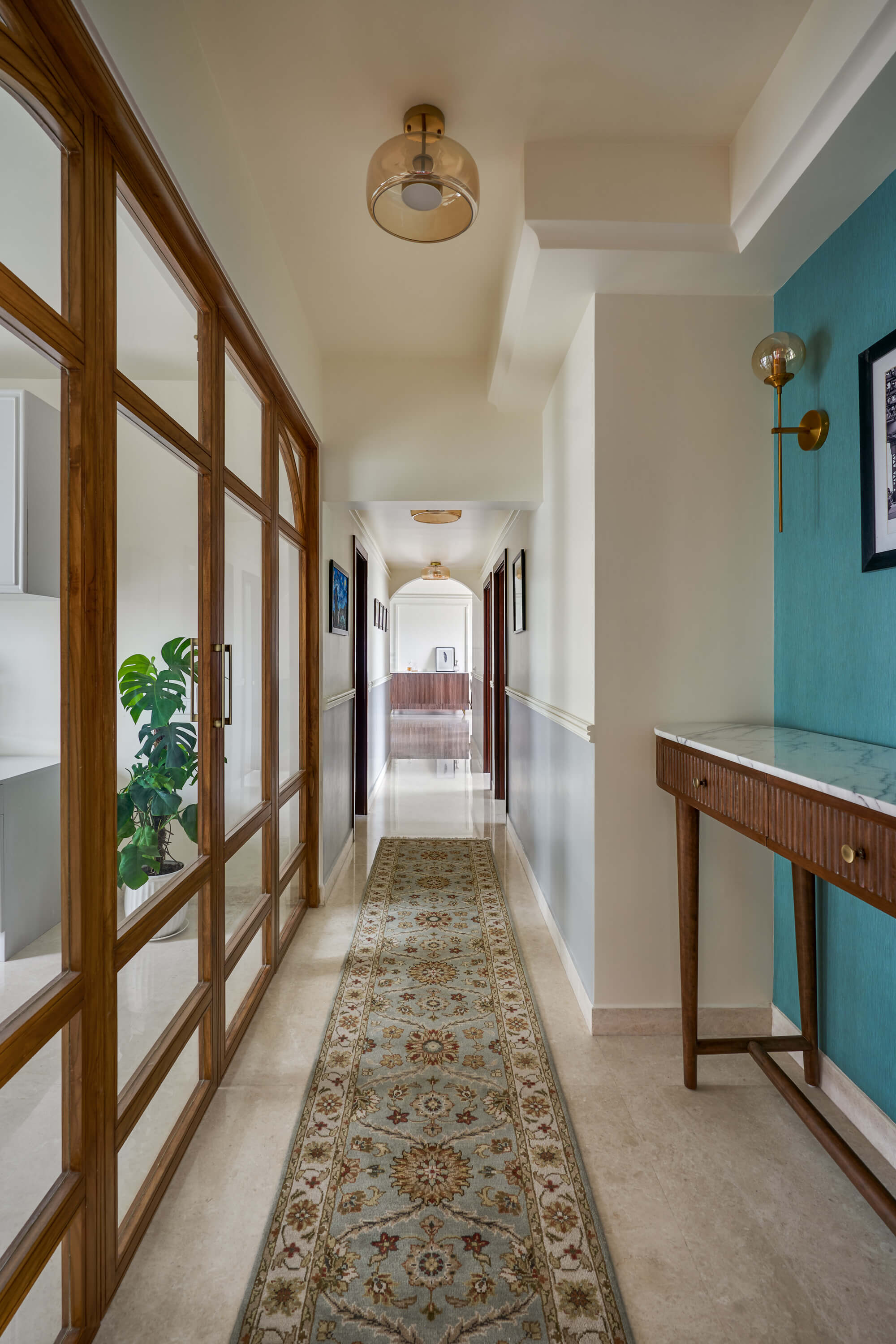
Cornices have been featured throughout Indian architectural history, being a part of extravagant castles. While they were once a sign of opulence, they are now more often used to make subtle statements. Almost every wall on the house features a cornice with its exclusive design. We designed, sketched, and made samples before finalizing the cornice on each wall.

Living Room

At the entryway, we transformed the cozy foyer with a vibrant splash of color, opting for a refreshing shade of blue to set the tone. Continuing with the blue theme, we picked out a sofa to match. To add in an element of playfulness, we put in a swing at the centre. Designed from scratch, the swing features brass highlights, a wraparound upholstered seat, and a Burma teak base. A discrete minimal modern bar made of wood breaks up the large white wall.

Kitchen

The kitchen was an important room for this couple, with the wife being a baker who worked from home. The room had to be both fun and functional. We carried on the blue theme here, with the lower cabinets painted a deep shade of blue, contrasted by the white ones above. We went with a clean herringbone white subway tile above the counter to break away from the solid color's monotony. We added a pop of print with the tiles on the floor to keep the space light.

Bedroom

The bedrooms were designed to stand out in their own ways. Each one had its own colour palette and materials to match. The statement piece for the first room was a green louvered wardrobe with heavily textured fabric.

The next bedroom featured cane elements and had a neutral colour palette, keeping the room light and airy. The bedroom is meant to emulate zen and calmness.

Master Bedroom

For the primary suite, we extended the blue tones in subtle elements. The bedding featured little pops of colour, with grey to provide a more relaxed contrast. The primary suite was meant to evoke a sense of calmness juxtaposed with bright tones of blue.

Living Dining

Arches instantly make a room look softer. They draw your eye to the height of the wall, giving you the opportunity to play around with space. We used arches in the home as entryways or to represent different areas to break away from uniformity and add in another element of playfulness. They make a statement, while still allowing for that smooth transition between rooms.

Gallery

Explore
Drag